Wildlife management decisions are rarely settled by ecological data alone. They live or die in the messy human world of competing values. Understanding what people think and why is as much a scientific skill as counting animals in a field. This tutorial walks you through quantitative analysis of a real attitude survey, using R.
Background and Learning Objectives
The ecological context
The Irish hare (Lepus timidus hibernicus) is a subspecies endemic to Ireland — found nowhere else on Earth. It has been present since before the last Ice Age, making it one of the island’s oldest residents and a genuine conservation priority.
The European (brown) hare (Lepus europaeus), by contrast, is an invasive species in Northern Ireland, introduced sometime in the 19th century, probably, like so many ecological misfortunes, by people who thought it was a good idea at the time. L. europaeus poses a threat to L. t. hibernicus through competition and hybridisation, and its management has been actively debated.
The question is not only can we cull brown hares, but should we and, critically, will people support it? That last consideration is where social science enters the room, takes off its coat, and starts asking uncomfortable questions.
Learning objectives
By the end of this tutorial you will be able to:
- Load, clean, and recode a real-world survey dataset using
tidyverse - Compute descriptive statistics
- Apply chi-square tests and Fisher’s exact test with appropriate multiple-comparison corrections
- Compute pairwise phi coefficients and visualise response linkages as networks
- Fit and interpret a binary logistic regression model
- Perform quantitative thematic analysis of multi-select responses
- Identify respondent classes and interpret them in meaningful ways
The study
This tutorial uses data from:
Caravaggi A, Montgomery WI, Reid N (2017). Management and control of invasive brown hares (Lepus europaeus): contrasting attitudes of selected environmental stakeholders and the wider rural community. Biology and Environment: Proceedings of the Royal Irish Academy, 117B, 53–63. https://doi.org/10.3318/bioe.2017.08
The study surveyed two groups:
- CAI: Members of Countryside Alliance Ireland — an organisation representing rural and field sports interests
- Public: The wider rural community (non-members)
Getting started
Packages
# Install any missing packages by uncommenting the line below
# install.packages(c("tidyverse","vcd","ca","igraph","ggraph",
#                    "corrplot","broom","scales","patchwork","janitor","ggrepel", "polCA"))

library(vcd)         # Visualising categorical data (mosaic plots, association stats)
library(ca)          # Correspondence analysis
library(igraph)      # Network/graph objects
library(ggraph)      # ggplot2-style network visualisation
library(corrplot)    # Correlation/association matrix heatmaps
library(broom)       # Converts messy model output into tidy data frames
library(scales)      # Axis label formatting helpers
library(patchwork)   # Combine multiple ggplots into one figure
library(janitor)     # Data cleaning utilities (clean_names, tabyl, etc.)
library(ggrepel)     # Non-overlapping text labels on plots
library(poLCA)       # Latent Class Analysis
library(tidyverse)   # The Swiss Army knife: dplyr, ggplot2, tidyr, readr, etc.

set.seed(42)  # Reproducibility: ensures any randomness gives the same result
              # 42 chosen for reasons that will be obvious to anyone who has
              # read the right books.
Loading the data
Download https://zenodo.org/records/891251 and place it in your working directory. The dataset is published under a CC BY 4.0 licence, meaning you can use it freely as long as you cite it.
# Load the raw data
# Adjust the path if your file is in a subfolder, e.g. "data/Hare_data.csv"
hare_raw <- read.csv("data.csv",
                     stringsAsFactors = FALSE,
                     na.strings        = c("", "NA"))

# clean_names() from {janitor} converts column names to consistent snake_case:
# "Own/rent land?" becomes "own_rent_land", "L. europaeus" becomes "l_europaeus", etc.
# This saves enormous amounts of grief when typing column names.
hare_raw <- clean_names(hare_raw)

dim(hare_raw)
## [1] 341 44The survey questions
Before we analyse anything, we should understand what was actually asked. Here are the 20 questions from the Caravaggi et al. (2017) questionnaire, mapped to the column names we will use in R.
| Q# | Question (abbreviated) | Column(s) | Type |
|---|---|---|---|
| 1a | Own or rent land? | own_rent_land |
Binary (Y/N) |
| 1b | Purpose (agriculture, game, conservation, recreation) | purpose |
Multi-select |
| 1c | Approximate area (ha) | size |
Numeric (free text) |
| 2a | Active farmer? | farmer |
Binary (Y/N) |
| 2b | Main farm focus | focus |
Multi-select |
| 3 | Conservation concern | conservation_concern |
Categorical (N/C) |
| 4a | Seen hares in NI? | seen_hares |
Binary (Y/N) |
| 4b | Most recent sighting | when |
Categorical (0/1–5/5+ years) |
| 5 | Consider hares pests? | consider_hares_pests |
Binary (Y/N) |
| 6 | Impression of hare numbers (last 50 yrs) | hare_numbers_50 |
Categorical (I/D/S) |
| 7 | Impression of hare numbers (last 5 yrs) | hare_numbers_5 |
Categorical |
| 8 | Aware two hare species in NI? | aware_of_2_sp_in_ni |
Binary (Y/N) |
| 9a | Ever seen L. europaeus in NI? | seen_l_europaeus |
Binary (Y/N) |
| 10a | Seen L. europaeus on own land? | seen_l_europaeus_on_own_land |
Binary (Y/N) |
| 10c | Most recent sighting on own land | most_recent |
Categorical |
| 11 | Is the threat of L. europaeus important? | is_threat_of_l_europaeus_important |
Binary (Y/N) |
| 12 | Support management of L. europaeus? | support_management_of_l_europaeus |
Binary (Y/N) |
| 13a | Support non-lethal habitat management? | habitat_management_for_l_t_hibernicus |
Binary (Y/N) |
| 13b | Support lethal culling? | lethal_culling |
Binary (Y/N) |
| 13c | Which culling methods? | shooting, netting,
trapping |
Multi-select |
| 14 | Sign a petition for action? | support_management_via_petition |
Binary (Y/N) |
| 15a | Allow land to be surveyed? | landowner_permission_to_survey |
Binary (Y/N) |
| 15b | Permit culling by shooting? | allow_cull_on_own_land |
Binary (Y/N) |
| 16 | Member of non-shooting conservation org? | member_of_conservation_org |
Binary (Y/N) |
| 17a | Hunt/shoot? | hunt |
Binary (Y/N) |
| 17b | What? (game birds, rabbits, wildfowl, etc.) | game_birds, rabbits,
wildfowl, fishing_angling |
Multi-select |
| 18 | Actively participate in coordinated shooting? | support_cull_with_direct_involvement |
Binary (Y/N) |
| 19 | Allow cull on land (if not participating)? | allow_cull_on_land |
Binary (Y/N) |
| 20 | Support a government-planned/supported cull? | support_gov_t_cull_decision |
Binary (Y/N) |
Notice that Q20 — support for a government-led cull — is our main outcome variable for the regression analysis later. Why might government backing matter to respondents? Consider how authority, legitimacy, and risk-sharing might influence someone’s stated support.
Coding conventions in this dataset: - Y
/ N = Yes / No
- C = Concerned (conservation concern variable)
- D = “Don’t know” (hare number trend variables)
- I / D / S = Increasing /
Decreasing / Stable (perception of hare numbers) - Dataset codes:
C = CAI member, P = Public (wider rural
community) - Zone codes: CORE, Periphery,
WIDER NI
Data Cleaning
Missing values, inconsistent coding, and columns that mean multiple things all need attention before we can do anything useful.
# Define the column groups — we will use these throughout
binary_cols <- c(
  "own_rent_land", "farmer", "seen_hares", "consider_hares_pests",
  "aware_of_2_sp_in_ni", "seen_l_europaeus", "seen_l_europaeus_on_own_land",
  "is_threat_of_l_europaeus_important", "support_management_of_l_europaeus",
  "habitat_management_for_l_t_hibernicus", "lethal_culling",
  "shooting", "netting", "trapping",
  "support_management_via_petition", "landowner_permission_to_survey",
  "allow_cull_on_own_land", "member_of_conservation_org",
  "hunt", "game_birds", "rabbits", "wildfowl", "fishing_angling",
  "support_cull_with_direct_involvement", "allow_cull_on_land",
  "support_gov_t_cull_decision"
)

mgmt_cols <- c(
  "support_management_of_l_europaeus", "habitat_management_for_l_t_hibernicus",
  "lethal_culling", "support_management_via_petition", "support_cull_with_direct_involvement",
  "allow_cull_on_land", "support_gov_t_cull_decision"
)

aware_cols   <- c("seen_hares", "seen_l_europaeus",
                  "aware_of_2_sp_in_ni", "is_threat_of_l_europaeus_important")

activity_cols <- c("hunt", "game_birds", "rabbits", "wildfowl", "fishing_angling")

cull_methods  <- c("shooting", "netting", "trapping")

# Recode and clean
hare <- hare_raw |>
  mutate(
    # --- Binary columns: "Y" -> TRUE, "N" -> FALSE, anything else -> NA ---
    across(all_of(binary_cols),
           ~ case_when(.x == "Y" ~ TRUE,
                       .x == "N" ~ FALSE,
                       TRUE      ~ NA)),

    # --- Hare number trends: replace "D" (don't know) with NA ---
    hare_numbers_50 = if_else(hare_numbers_50 == "D", NA_character_, hare_numbers_50),
    hare_numbers_5  = if_else(hare_numbers_5  == "D", NA_character_, hare_numbers_5),

    # --- Conservation concern: factor with meaningful labels ---
    conservation_concern = factor(conservation_concern,
                                  levels = c("N", "C"),
                                  labels = c("Not concerned", "Concerned")),

    # --- Respondent group: this is the key grouping variable ---
    group = factor(dataset,
                   levels = c("C", "P"),
                   labels = c("CAI", "Public")),

    # --- Geographic zone: ordered from core range outward ---
    zone = factor(zone, levels = c("CORE", "PERIPHERY", "WIDER NI")),

    # --- Landholding size: strip text ("25a", "200ha") and convert to numeric ---
    size_ha = suppressWarnings(parse_number(size)),

    # --- Survey date ---
    survey_date = dmy(date)
  )

# Quick sanity check
glimpse(hare)
## Rows: 341
## Columns: 47
## $ reference <chr> "HP00514", "HP00714", "HP00914",…
## $ dataset <chr> "P", "P", "P", "P", "P", "P", "P…
## $ zone <fct> CORE, CORE, CORE, CORE, CORE, CO…
## $ date <chr> "13/08/2014", "13/08/2014", "30/…
## $ own_rent_land <lgl> TRUE, TRUE, TRUE, TRUE, TRUE, TR…
## $ purpose <chr> "A", "A", NA, "A", "A", NA, NA, …
## $ purpose_1 <chr> NA, NA, NA, NA, NA, NA, NA, NA, …
## $ size <chr> "180a", "50ha", "3a", "8ha", "14…
## $ farmer <lgl> TRUE, TRUE, FALSE, TRUE, TRUE, F…
## $ focus <chr> "D", "B", NA, "B", "S", NA, NA, …
## $ focus_1 <chr> NA, NA, NA, "S", NA, NA, NA, NA,…
## $ focus_2 <chr> NA, NA, NA, "A", NA, NA, NA, NA,…
## $ conservation_concern <fct> Concerned, Not concerned, Concer…
## $ seen_hares <lgl> TRUE, TRUE, TRUE, TRUE, TRUE, TR…
## $ when <int> 0, 0, 1, 0, 6, 0, 2, 0, 1, 1, 0,…
## $ consider_hares_pests <lgl> FALSE, TRUE, TRUE, FALSE, FALSE,…
## $ hare_numbers_50 <chr> "I", "I", NA, NA, NA, "N", NA, "…
## $ hare_numbers_5 <chr> "N", "I", NA, NA, "N", "N", NA, …
## $ aware_of_2_sp_in_ni <lgl> FALSE, TRUE, FALSE, FALSE, FALSE…
## $ seen_l_europaeus <lgl> FALSE, FALSE, FALSE, FALSE, FALS…
## $ seen_l_europaeus_on_own_land <lgl> FALSE, TRUE, FALSE, FALSE, FALSE…
## $ most_recent <int> NA, 0, NA, NA, NA, NA, NA, NA, N…
## $ is_threat_of_l_europaeus_important <lgl> TRUE, TRUE, TRUE, FALSE, TRUE, T…
## $ support_management_of_l_europaeus <lgl> TRUE, TRUE, TRUE, TRUE, TRUE, TR…
## $ habitat_management_for_l_t_hibernicus <lgl> TRUE, TRUE, FALSE, TRUE, TRUE, T…
## $ lethal_culling <lgl> TRUE, TRUE, FALSE, FALSE, FALSE,…
## $ shooting <lgl> TRUE, NA, NA, NA, NA, NA, NA, TR…
## $ netting <lgl> NA, NA, NA, NA, NA, NA, NA, NA, …
## $ trapping <lgl> NA, NA, NA, NA, NA, NA, NA, NA, …
## $ other <chr> NA, NA, NA, NA, NA, NA, NA, NA, …
## $ support_management_via_petition <lgl> TRUE, TRUE, FALSE, FALSE, TRUE, …
## $ landowner_permission_to_survey <lgl> TRUE, TRUE, TRUE, TRUE, TRUE, NA…
## $ allow_cull_on_own_land <lgl> TRUE, TRUE, FALSE, FALSE, TRUE, …
## $ member_of_conservation_org <lgl> FALSE, TRUE, FALSE, FALSE, FALSE…
## $ hunt <lgl> TRUE, TRUE, FALSE, FALSE, FALSE,…
## $ game_birds <lgl> TRUE, NA, NA, NA, NA, NA, NA, TR…
## $ rabbits <lgl> TRUE, NA, NA, NA, NA, NA, NA, TR…
## $ wildfowl <lgl> TRUE, NA, NA, NA, NA, NA, NA, TR…
## $ fishing_angling <lgl> NA, NA, NA, NA, NA, NA, NA, TRUE…
## $ other_1 <chr> NA, NA, NA, NA, NA, NA, NA, NA, …
## $ other_2 <chr> NA, NA, NA, NA, NA, NA, NA, NA, …
## $ support_cull_with_direct_involvement <lgl> TRUE, TRUE, FALSE, FALSE, TRUE, …
## $ allow_cull_on_land <lgl> NA, TRUE, FALSE, FALSE, TRUE, TR…
## $ support_gov_t_cull_decision <lgl> TRUE, TRUE, FALSE, FALSE, TRUE, …
## $ group <fct> Public, Public, Public, Public, …
## $ size_ha <dbl> 180, 50, 3, 8, 14, NA, NA, 2, 27…
## $ survey_date <date> 2014-08-13, 2014-08-13, 2014-08…# Respondents by group
hare |> count(group) |> mutate(pct = round(n / sum(n) * 100, 1))## group n pct
## 1 CAI 139 40.8
## 2 Public 202 59.2# Respondents by zone
hare |> count(zone) |> mutate(pct = round(n / sum(n) * 100, 1))## zone n pct
## 1 CORE 119 34.9
## 2 PERIPHERY 112 32.8
## 3 WIDER NI 110 32.3Why TRUE/FALSE and not
1/0? Storing binary variables as
logicals helps us: sum(seen_hares, na.rm = TRUE)
automatically counts the TRUE values (i.e., the “Yes”
responses), and mean(seen_hares, na.rm = TRUE) gives the
proportion. It also makes the code read more easily, which matters when
you’re debugging at 11pm the night before a deadline.
Who Responded? Descriptive Statistics
Before asking what people think, we need to understand who answered. A survey result is only interpretable in the context of the sample it came from. A finding that “80% support culling” means something quite different if your respondents are exclusively members of a field sports organisation versus a random sample of the public.
# Landowner and farmer profile
hare |>
  summarise(
    n_own_land  = sum(own_rent_land, na.rm = TRUE),
    pct_own     = round(mean(own_rent_land, na.rm = TRUE) * 100, 1),
    n_farmer    = sum(farmer, na.rm = TRUE),
    pct_farmer  = round(mean(farmer, na.rm = TRUE) * 100, 1),
    n_consorg   = sum(member_of_conservation_org, na.rm = TRUE),
    pct_consorg = round(mean(member_of_conservation_org, na.rm = TRUE) * 100, 1)
  )
## n_own_land pct_own n_farmer pct_farmer n_consorg pct_consorg
## 1 225 66 116 34 26 7.8# Hare awareness
hare |>
summarise(
pct_seen_hares = round(mean(seen_hares, na.rm = TRUE) * 100, 1),
pct_seen_leu = round(mean(seen_l_europaeus, na.rm = TRUE) * 100, 1),
pct_aware_2sp = round(mean(aware_of_2_sp_in_ni, na.rm = TRUE) * 100, 1),
pct_pests = round(mean(consider_hares_pests, na.rm = TRUE) * 100, 1),
pct_threat_import = round(mean(is_threat_of_l_europaeus_important,
na.rm = TRUE) * 100, 1)
)## pct_seen_hares pct_seen_leu pct_aware_2sp pct_pests pct_threat_import
## 1 93.8 32.1 42.1 14.1 64.9# Management support (overall)
hare |>
dplyr::select(all_of(mgmt_cols)) |>
summarise(across(everything(),
list(n_yes = ~sum(., na.rm = TRUE),
n_tot = ~sum(!is.na(.)),
pct = ~round(mean(., na.rm = TRUE) * 100, 1)))) |>
pivot_longer(everything(),
names_to = c("variable", ".value"),
names_sep = "_(?=[^_]+$)") |>
arrange(desc(pct))## # A tibble: 14 × 4
## variable yes tot pct
## <chr> <int> <int> <dbl>
## 1 habitat_management_for_l_t_hibernicus NA NA 79.5
## 2 support_management_of_l_europaeus NA NA 78
## 3 support_gov_t_cull_decision NA NA 58.9
## 4 lethal_culling NA NA 51.6
## 5 support_management_via_petition NA NA 47
## 6 allow_cull_on_land NA NA 42.9
## 7 support_cull_with_direct_involvement NA NA 35.3
## 8 support_management_of_l_europaeus_n 259 332 NA
## 9 habitat_management_for_l_t_hibernicus_n 213 268 NA
## 10 lethal_culling_n 166 322 NA
## 11 support_management_via_petition_n 154 328 NA
## 12 support_cull_with_direct_involvement_n 110 312 NA
## 13 allow_cull_on_land_n 85 198 NA
## 14 support_gov_t_cull_decision_n 189 321 NA# Rural activities (multi-select)
hare |>
dplyr::select(all_of(activity_cols)) |>
summarise(across(everything(),
list(n = ~sum(., na.rm = TRUE),
pct = ~round(mean(., na.rm = TRUE) * 100, 1)))) |>
pivot_longer(everything(),
names_to = c("activity", ".value"),
names_sep = "_(?=[^_]+$)")## # A tibble: 5 × 3
## activity n pct
## <chr> <int> <dbl>
## 1 hunt 163 50.6
## 2 game_birds 109 100
## 3 rabbits 88 100
## 4 wildfowl 88 100
## 5 fishing_angling 71 100Visualisation
Awareness by geographic zone
One of the central ecological questions in this study is whether proximity to established L. europaeus populations affects awareness. Respondents from the CORE zone live alongside the invasive species; those in WIDER NI may never have encountered one. Do their perceptions differ?
aware_labels <- c(
  seen_hares                           = "Seen Irish hares",
  seen_l_europaeus                     = "Seen European hares",
  aware_of_2_sp_in_ni                  = "Aware of 2 species in NI",
  is_threat_of_l_europaeus_important   = "Considers European hare threat important"
)

hare |>
  dplyr::select(zone, all_of(aware_cols)) |>
  pivot_longer(-zone) |>
  group_by(zone, name) |>
  summarise(pct = mean(value, na.rm = TRUE) * 100, .groups = "drop") |>
  mutate(name = factor(name, levels = names(aware_labels), labels = aware_labels)) |>
  ggplot(aes(x = zone, y = pct, fill = name)) +
  geom_col(position = "dodge") +
  geom_hline(yintercept = 50, linetype = "dashed", colour = "grey50", linewidth = 0.5) +
  scale_fill_brewer(palette = "Set2") +
  scale_y_continuous(labels = percent_format(scale = 1), limits = c(0, 105)) +
  labs(title    = "Hare awareness by geographic zone",
       subtitle = "Dashed line = 50%",
       x = "Zone", y = "% respondents answering Yes", fill = NULL) +
  theme_minimal(base_size = 12) +
  theme(legend.position = "bottom",
        legend.text = element_text(size = 9))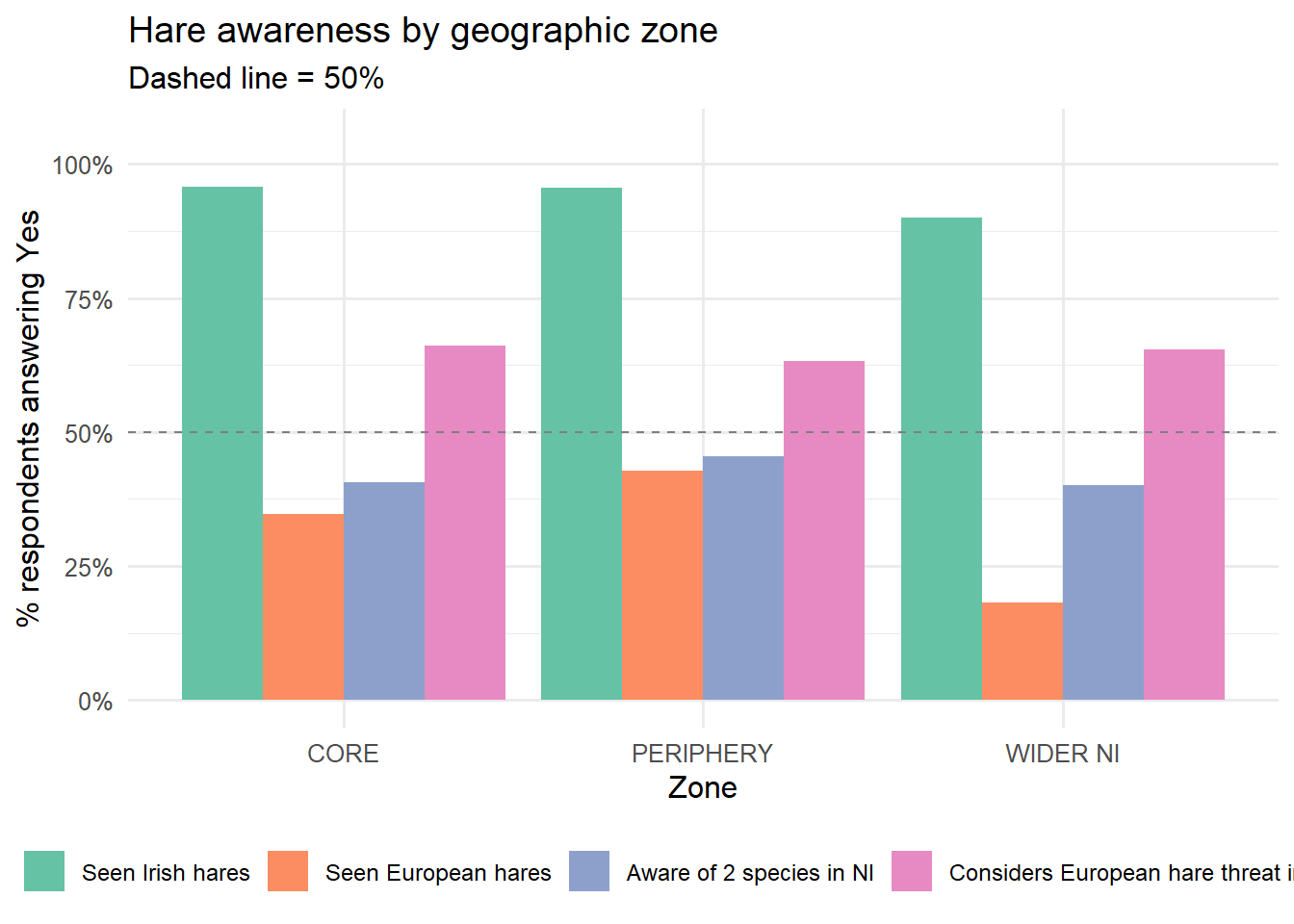
Conservation concern: a mosaic plot
A mosaic plot is the multivariate extension of a stacked bar chart. The width of each column represents the proportion of respondents in that group; the height of each cell within the column represents the proportion choosing each response. Colour shading (Pearson residuals) shows which cells deviate from what you would expect if group membership and conservation concern were independent.
# Compute residuals
tbl <- table(Group   = hare$group,
             Concern = hare$conservation_concern) |>
  (\(t) t[rowSums(t) > 0, colSums(t) > 0])()

res_df <- chisq.test(tbl)$residuals |>
  as.data.frame() |>
  rename(group = Group, concern = Concern, residual = Freq)

# Compute proportions for tile sizing
prop_df <- as.data.frame(prop.table(tbl, margin = 1)) |>
  rename(group = Group, concern = Concern, prop = Freq)

plot_df <- left_join(res_df, prop_df, by = c("group", "concern"))

ggplot(plot_df, aes(x = concern, y = group, fill = residual)) +
  geom_tile(colour = "white", linewidth = 3) +
  geom_text(aes(label = round(residual, 2)),
            size = 4.5, fontface = "bold",
            colour = "white") +
  scale_fill_gradient2(
    low      = "#d73027",
    mid      = "white",
    high     = "#2166ac",
    midpoint = 0,
    name     = "Pearson\nresidual"
  ) +
  labs(
    title    = "Conservation concern by respondent group",
    subtitle = "Cell colour = Pearson residual.Blue = more than expected. Red = fewer",
    x        = "Conservation concern",
    y        = NULL
  ) +
  theme_minimal(base_size = 13) +
  theme(panel.grid = element_blank())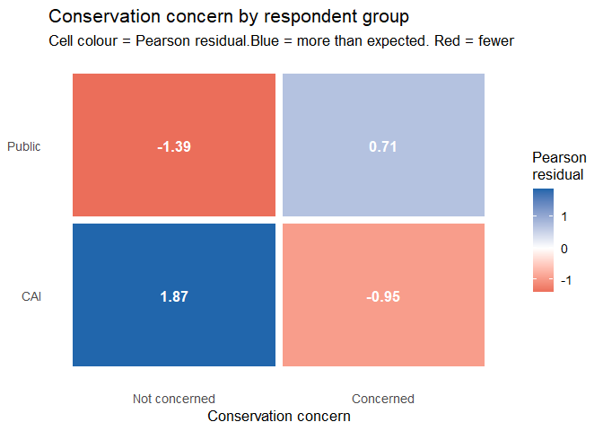
The shading uses Pearson residuals — the difference between observed and expected cell counts, standardised by the square root of the expected count. A residual greater than ±2 is conventionally considered noteworthy. Which cells, if any, show strong deviations? What might explain them?
Management support: bar chart and heatmap
We want to see not just overall support levels, but how much the two groups differ. A bar chart gives the absolute picture; a heatmap lets the eye quickly spot patterns across many variables simultaneously.
mgmt_labels <- c(
  support_management_of_l_europaeus       = "General management\nsupport",
  habitat_management_for_l_t_hibernicus   = "Habitat management\n(non-lethal)",
  lethal_culling                          = "Lethal culling (any)",
  support_management_via_petition         = "Sign a petition",
  support_cull_with_direct_involvement    = "Direct involvement\nin cull",
  allow_cull_on_land                      = "Allow cull on land",
  support_gov_t_cull_decision             = "Support\nGovernment cull"
)

plot_df <- hare |>
  dplyr::select(group, all_of(mgmt_cols)) |>
  pivot_longer(-group) |>
  group_by(group, name) |>
  summarise(pct = mean(value, na.rm = TRUE) * 100, .groups = "drop") |>
  mutate(name = factor(name, levels = names(mgmt_labels), labels = mgmt_labels))

p_bar <- ggplot(plot_df, aes(x = pct, y = fct_rev(name), fill = group)) +
  geom_col(position = position_dodge(0.7), width = 0.6) +
  geom_text(aes(label = paste0(round(pct), "%")),
            position = position_dodge(0.7), hjust = -0.1, size = 3) +
  scale_fill_manual(values = c("CAI" = "#2166ac", "Public" = "#d73027")) +
  scale_x_continuous(limits = c(0, 115), labels = percent_format(scale = 1)) +
  labs(title    = "Support for European hare management strategies",
       subtitle = "By respondent group",
       x = "% respondents", y = NULL, fill = NULL) +
  theme_minimal(base_size = 11) +
  theme(legend.position = "top")

print(p_bar)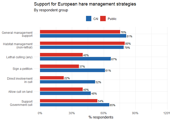
ggplot(plot_df, aes(x = name, y = group, fill = pct)) +
  geom_tile(colour = "white", linewidth = 0.8) +
  geom_text(aes(label = paste0(round(pct), "%")),
            size = 3.5, colour = "grey20") +
  scale_fill_gradient2(
    low      = "#d73027",
    mid      = "white",
    high     = "#2166ac",
    midpoint = 50,
    limits   = c(0, 100),
    name     = "% Yes"
  ) +
  labs(title = "Management support patterns",
       subtitle = "Heatmap view — each cell shows % respondents answering Yes",
       x = NULL, y = NULL) +
  theme_minimal(base_size = 11) +
  theme(axis.text.x = element_text(angle = 40, hjust = 1, size = 9))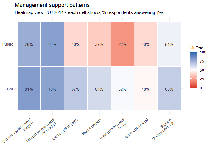
The bar chart is better for reading exact values and comparing groups side-by-side. The heatmap is better for spotting patterns across many variables at once. Neither is objectively superior — it depends on what question you are trying to answer. In a real report, you would probably use one or the other, not both.
Group comparisons: Chi-square and Fisher’s exact tests
Theory
The chi-square test asks a simple question: is there a statistically significant association between two categorical variables? It does so by comparing the counts of actual observations to the counts you would expect if the variables were completely independent.
When any expected cell count falls below 5, the chi approximation becomes unreliable. Fisher’s exact test calculates the exact probability rather than an approximation so is always valid.
A chi-square test does not tell Whether the association is large or small, however. A statistically significant result only means that the effect is probably not zero and not that it is meaningful. To explore meaning we need a measure of effect size.
Cramér’s V: measuring effect size
Cramér’s V scales the \(\chi^2\) statistic to a 0–1 range, correcting for sample size and table dimensions. Typically we interpret V as ~0.1 = small, ~0.3 = medium, ~0.5 = large.
Applying to our data
We test each management variable against group membership (CAI vs Public). In plain terms we’re asking whether each group answers differently on this issue. We’re asking this of 10 variables and if you test things many times then the likelihood of false positives increases considerably. To mitigate this we also apply a Bonferroni correction that divides our usual cutoff for ‘significant’ by the number of tests. We have 10 tests so our P threshold is now 0.005.
# A function that runs the appropriate test for a single variable
compare_groups <- function(var, data = hare) {
  tbl    <- table(data$group, data[[var]])
  # Suppress warnings about small expected values (we check manually)
  exp_ct <- suppressWarnings(chisq.test(tbl)$expected)

  if (any(exp_ct < 5, na.rm = TRUE)) {
    test   <- fisher.test(tbl)
    method <- "Fisher"
    stat   <- NA_real_
    p      <- test$p.value
    OR     <- as.numeric(test$estimate)
  } else {
    test   <- suppressWarnings(chisq.test(tbl))
    method <- "Chi-sq"
    stat   <- as.numeric(test$statistic)
    p      <- test$p.value
    # Cramér's V for chi-square
    n_obs  <- sum(tbl)
    OR     <- sqrt(stat / (n_obs * (min(dim(tbl)) - 1)))  # repurpose column for V
  }

  tibble(
    variable  = var,
    method    = method,
    statistic = round(stat, 3),
    p_value   = round(p, 4),
    cramers_V_or_OR = round(OR, 3),
    effect_note = if_else(method == "Chi-sq", "Cramer's V", "Odds ratio"),
    sig = case_when(p < 0.001 ~ "***",
                    p < 0.01  ~ "**",
                    p < 0.05  ~ "*",
                    TRUE       ~ "")
  )
}
comparison_table <- map_dfr(mgmt_cols, compare_groups) |>
arrange(p_value) |>
mutate(
p_bonferroni = p.adjust(p_value, method = "bonferroni"),
sig_bonf = case_when(p_bonferroni < 0.001 ~ "***",
p_bonferroni < 0.01 ~ "**",
p_bonferroni < 0.05 ~ "*",
TRUE ~ "ns")
)
comparison_table |>
dplyr::select(variable, method, statistic, p_value, cramers_V_or_OR,
effect_note, sig, sig_bonf) |>
knitr::kable(
caption = "Table 2. Statistical comparisons of management support between CAI members and Public respondents. Sig. = before Bonferroni correction; Sig. (Bonf.) = after correction.",
col.names = c("Variable","Test","Statistic","p-value",
"Effect size","Measure","Sig.","Sig. (Bonf.)")
)| Variable | Test | Statistic | p-value | Effect size | Measure | Sig. | Sig. (Bonf.) |
|---|---|---|---|---|---|---|---|
| lethal_culling | Chi-sq | 21.041 | 0.0000 | 0.256 | Cramer’s V | *** | *** |
| support_management_via_petition | Chi-sq | 18.508 | 0.0000 | 0.238 | Cramer’s V | *** | *** |
| support_cull_with_direct_involvement | Chi-sq | 28.094 | 0.0000 | 0.300 | Cramer’s V | *** | *** |
| support_gov_t_cull_decision | Chi-sq | 3.571 | 0.0588 | 0.105 | Cramer’s V | ns | |
| support_management_of_l_europaeus | Chi-sq | 1.191 | 0.2751 | 0.060 | Cramer’s V | ns | |
| allow_cull_on_land | Chi-sq | 0.752 | 0.3857 | 0.062 | Cramer’s V | ns | |
| habitat_management_for_l_t_hibernicus | Chi-sq | 0.000 | 1.0000 | 0.000 | Cramer’s V | ns |
Does species awareness predict management support?
An ecologically interesting sub-question: do respondents who know there are two hare species in Northern Ireland show different levels of support for management?
hare |>
  filter(!is.na(aware_of_2_sp_in_ni),
         !is.na(support_management_of_l_europaeus)) |>
  count(aware_of_2_sp_in_ni, support_management_of_l_europaeus) |>
  mutate(
    aware_of_2_sp_in_ni              = if_else(aware_of_2_sp_in_ni, "Aware", "Not aware"),
    support_management_of_l_europaeus = if_else(support_management_of_l_europaeus,
                                                 "Supports", "Opposes")
  ) |>
knitr::kable(caption = "Table 3. Species awareness vs management support crosstab.")| aware_of_2_sp_in_ni | support_management_of_l_europaeus | n |
|---|---|---|
| Not aware | Opposes | 39 |
| Not aware | Supports | 151 |
| Aware | Opposes | 33 |
| Aware | Supports | 108 |
fisher.test(table(hare$aware_of_2_sp_in_ni,
                  hare$support_management_of_l_europaeus))
##
## Fisher's Exact Test for Count Data
##
## data: table(hare$aware_of_2_sp_in_ni, hare$support_management_of_l_europaeus)
## p-value = 0.5904
## alternative hypothesis: true odds ratio is not equal to 1
## 95 percent confidence interval:
## 0.4839208 1.4835166
## sample estimates:
## odds ratio
## 0.8457105If people who are more aware of the species distinction are less likely to support management, what might this suggest? Could ecological knowledge cut both ways - increasing concern for the Irish hare but also increasing reluctance to sanction lethal control of the other? This is a genuinely interesting question that has real implications for how conservation communication should be framed.
Response linkage: association analysis
Theory: phi coefficients for binary data
So far we have been looking at one variable at a time, or comparing one variable against group membership. But survey responses are not independent of each other. Someone who says they would sign a petition may also be likely to allow a cull on their land. Mapping these internal associations reveals the structure of opinion.
For two binary (Y/N) variables, the appropriate correlation coefficient is phi (\(\phi\)), which is conceptually identical to Pearson’s \(r\) applied to 0/1-coded data.
Computing the phi matrix
all_binary_cols <- c(aware_cols, mgmt_cols, "member_of_conservation_org", activity_cols)

binary_mat <- hare |>
  dplyr::select(all_of(all_binary_cols)) |>
  mutate(across(everything(), as.integer))

phi_mat <- cor(binary_mat, use = "pairwise.complete.obs")
## Warning in cor(binary_mat, use = "pairwise.complete.obs"): the standard
## deviation is zerophi_mat[is.na(phi_mat)] <- 0 # replace NA correlations with 0
# Readable labels
nice_names <- c(
seen_hares = "Seen Irish hare",
seen_l_europaeus = "Seen Eur. hare",
aware_of_2_sp_in_ni = "Aware 2 spp",
is_threat_of_l_europaeus_important = "Threat important",
support_management_of_l_europaeus = "Support mgmt",
habitat_management_for_l_t_hibernicus= "Habitat mgmt",
lethal_culling = "Lethal cull",
support_management_via_petition = "Petition",
support_cull_with_direct_involvement = "Direct involve",
allow_cull_on_land = "Allow cull",
support_gov_t_cull_decision = "Govt cull",
member_of_conservation_org = "Consv org",
hunt = "Hunt",
game_birds = "Game birds",
rabbits = "Rabbits",
wildfowl = "Wildfowl",
fishing_angling = "Fishing"
)
rownames(phi_mat) <- colnames(phi_mat) <- nice_names[colnames(phi_mat)]Heatmap of phi coefficients
# Make the plot device tall and wide before calling corrplot
par(oma = c(0, 0, 2, 0))  # outer margin for title

corrplot(
  phi_mat,
  method       = "color",
  type         = "lower",          # full matrix reads better at this size
  order        = "hclust",        # group correlated variables together
  hclust.method = "ward.D2",      # matches your clustering analysis
  tl.cex       = 0.85,            # larger labels
  tl.col       = "black",
  tl.srt       = 45,              # angled top labels, less cramped
  addCoef.col  = "black",
  number.cex   = 0.65,
  number.digits = 1,              # 1 decimal place keeps cells readable
  col          = colorRampPalette(c("#d73027", "white", "#2166ac"))(200),
  mar          = c(0, 0, 1, 0),
  diag         = FALSE            # hide the diagonal 1s
)
title("Phi coefficients: binary response associations",
      outer = TRUE, cex.main = 1.1)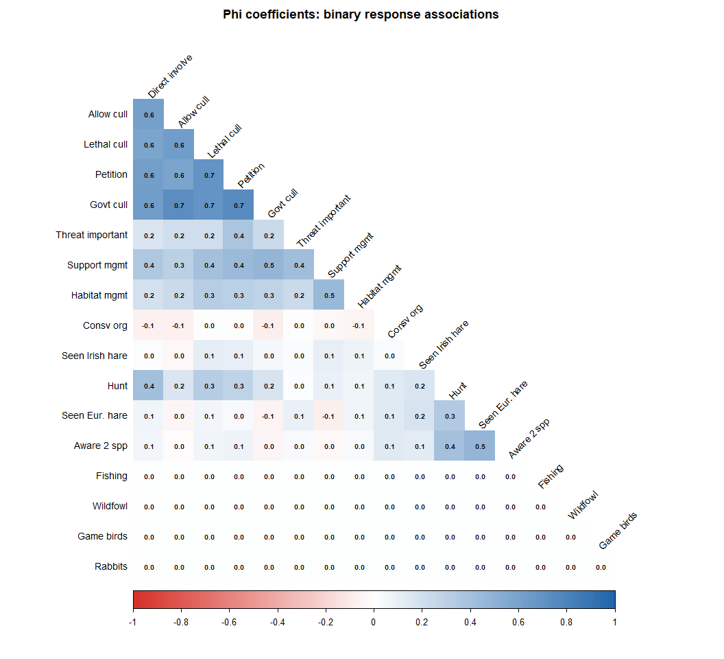
Hierarchical clustering: what clusters with what?
Hierarchical clustering groups variables by similarity. Here we treat \(1 - |\phi|\) as a distance (so highly associated variables, whether positively or negatively, are close together), and use Ward’s D2 linkage to merge groups.
dist_mat   <- as.dist(1 - abs(phi_mat))
hclust_res <- hclust(dist_mat, method = "ward.D2")

plot(hclust_res,
     main  = "Hierarchical clustering of questionnaire responses",
     sub   = "Distance = 1 - |φ|  (Ward's D2 linkage)",
     xlab  = "Response variable",
     ylab  = "Distance",
     cex   = 0.85)
rect.hclust(hclust_res, k = 4,
            border = c("#e41a1c", "#377eb8", "#4daf4a", "#984ea3"))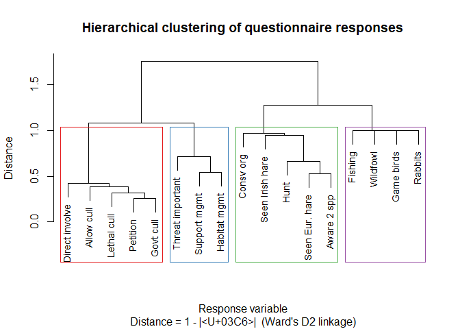
Variables that merge at a low height are closely associated.
Variables that only merge near the top of the tree are weakly
associated. The coloured rectangles suggest a four-cluster partition but
selecting \(k\) is a judgement call,
not an algorithm output. Try k = 3 and k = 5
and see how the interpretation changes.
Association network
We can go one step further and visualise the associations as a network where variables are nodes, and we draw an edge between two nodes if their \(|\phi| > 0.3\) (a conventional threshold for a “meaningful” binary association). Edge thickness and colour encode the strength and direction of the association.
phi_long <- as_tibble(phi_mat, rownames = "from") |>
  pivot_longer(-from, names_to = "to", values_to = "phi") |>
  filter(from < to,        # lower triangle only — avoid duplicate edges
         abs(phi) > 0.3,
         !is.na(phi))

if (nrow(phi_long) > 0) {
  g <- graph_from_data_frame(
    d        = phi_long |> mutate(weight = abs(phi)),
    directed = FALSE,
    vertices = tibble(name = colnames(phi_mat))
  )
  E(g)$sign <- ifelse(phi_long$phi > 0, "positive", "negative")

  set.seed(42)
  ggraph(g, layout = "fr") +
    geom_edge_link(aes(width = weight, colour = sign), alpha = 0.8) +
    geom_node_point(size = 7, colour = "#444444", fill = "#dddddd",
                    shape = 21, stroke = 1) +
    geom_node_text(aes(label = name), size = 2.8, repel = TRUE,
                   max.overlaps = 20) +
    scale_edge_width(range = c(0.5, 3.5), name = "|φ|") +
    scale_edge_colour_manual(
      values = c(positive = "#2166ac", negative = "#d73027"),
      name   = "Direction"
    ) +
    labs(
      title    = "Association network: questionnaire responses",
      subtitle = "Edges where |φ| > 0.3 · blue = positive · red = negative"
    ) +
    theme_graph(base_family = "sans") +
    theme(legend.position = "right")
} else {
  cat("No pairs with |phi| > 0.3 in this sample. Try lowering the threshold.\n")
}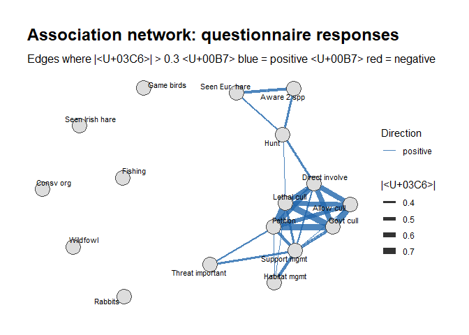
In a well-designed attitude survey, you often see two major clusters: one for knowledge/awareness items and one for action/support items. Do these emerge here? What does it mean if awareness and support cluster together — or separately?
Logistic Regression: Predicting Support for a Government Cull
We have established that the groups differ. Now we want to know what predicts support for the most politically significant outcome: a government-planned cull (Q20). Our outcome is binary — it can only be 0 or 1. Ordinary linear regression can predict values outside this range, which is nonsensical. Logistic regression models the log-odds of the outcome, guaranteeing that predicted probabilities stay between 0 and 1.
Fitting the model
hare_mod <- hare |>
  mutate(
    group                = relevel(group, ref = "Public"),
    conservation_concern = relevel(conservation_concern, ref = "Not concerned")
  ) |>
  filter(!is.na(support_gov_t_cull_decision))

glm_fit <- glm(
  support_gov_t_cull_decision ~
    group + zone + own_rent_land + conservation_concern +
    aware_of_2_sp_in_ni + consider_hares_pests +
    is_threat_of_l_europaeus_important + hunt,
  data   = hare_mod,
  family = binomial(link = "logit")
)

summary(glm_fit)
##
## Call:
## glm(formula = support_gov_t_cull_decision ~ group + zone + own_rent_land +
## conservation_concern + aware_of_2_sp_in_ni + consider_hares_pests +
## is_threat_of_l_europaeus_important + hunt, family = binomial(link = "logit"),
## data = hare_mod)
##
## Coefficients:
## Estimate Std. Error z value Pr(>|z|)
## (Intercept) -0.25476 0.51240 -0.497 0.6191
## groupCAI 0.06835 0.46442 0.147 0.8830
## zonePERIPHERY 0.24281 0.37854 0.641 0.5212
## zoneWIDER NI 0.09899 0.38234 0.259 0.7957
## own_rent_landTRUE -0.28734 0.35088 -0.819 0.4128
## conservation_concernConcerned 0.25992 0.39922 0.651 0.5150
## aware_of_2_sp_in_niTRUE -0.76739 0.38291 -2.004 0.0451 *
## consider_hares_pestsTRUE -0.20057 0.41016 -0.489 0.6248
## is_threat_of_l_europaeus_importantTRUE 0.82124 0.32678 2.513 0.0120 *
## huntTRUE 1.20848 0.48102 2.512 0.0120 *
## ---
## Signif. codes: 0 '***' 0.001 '**' 0.01 '*' 0.05 '.' 0.1 ' ' 1
##
## (Dispersion parameter for binomial family taken to be 1)
##
## Null deviance: 262.50 on 199 degrees of freedom
## Residual deviance: 241.55 on 190 degrees of freedom
## (121 observations deleted due to missingness)
## AIC: 261.55
##
## Number of Fisher Scoring iterations: 4Odds ratios and confidence intervals
We calculate odds ratios in logistic regression to express how much the odds of an outcome change when a predictor increases or differs between groups. They make results easier to interpret by turning model coefficients into a clear “how many times more or less likely” comparison.
glm_tidy <- tidy(glm_fit, conf.int = TRUE, exponentiate = TRUE) |>
  filter(term != "(Intercept)") |>
  mutate(
    sig = case_when(p.value < 0.001 ~ "***",
                    p.value < 0.01  ~ "**",
                    p.value < 0.05  ~ "*",
                    TRUE             ~ "")
  )

glm_tidy |>
  dplyr::select(term, estimate, conf.low, conf.high, p.value, sig) |>
  knitr::kable(
    digits  = 3,
    caption = "Table 4. Logistic regression results. Odds ratios (ORs) with 95% confidence intervals and p-values. Reference group: Public respondents; Not concerned about conservation.",
    col.names = c("Predictor", "OR", "95% CI lower", "95% CI upper", "p-value", "Sig.")
)| Predictor | OR | 95% CI lower | 95% CI upper | p-value | Sig. |
|---|---|---|---|---|---|
| groupCAI | 1.071 | 0.424 | 2.654 | 0.883 | |
| zonePERIPHERY | 1.275 | 0.609 | 2.701 | 0.521 | |
| zoneWIDER NI | 1.104 | 0.523 | 2.353 | 0.796 | |
| own_rent_landTRUE | 0.750 | 0.374 | 1.487 | 0.413 | |
| conservation_concernConcerned | 1.297 | 0.587 | 2.832 | 0.515 | |
| aware_of_2_sp_in_niTRUE | 0.464 | 0.215 | 0.970 | 0.045 | * |
| consider_hares_pestsTRUE | 0.818 | 0.367 | 1.851 | 0.625 | |
| is_threat_of_l_europaeus_importantTRUE | 2.273 | 1.203 | 4.349 | 0.012 | * |
| huntTRUE | 3.348 | 1.342 | 8.956 | 0.012 | * |
ggplot(glm_tidy, aes(x = estimate, y = reorder(term, estimate))) +
  geom_point(size = 3.5, colour = "#2166ac") +
  geom_errorbarh(aes(xmin = conf.low, xmax = conf.high),
                 height = 0.3, colour = "#2166ac", linewidth = 0.8) +
  geom_vline(xintercept = 1, linetype = "dashed", colour = "#e74c3c",
             linewidth = 0.8) +
  scale_x_log10() +
  labs(
    title    = "Predictors of government cull support",
    subtitle = "Odds ratios with 95% CI (log scale)",
    x = "Odds ratio", y = NULL
  ) +
  theme_minimal(base_size = 12)
## Warning: `geom_errorbarh()` was deprecated in ggplot2 4.0.0.
## ℹ Please use the `orientation` argument of `geom_errorbar()` instead.
## This warning is displayed once every 8 hours.
## Call `lifecycle::last_lifecycle_warnings()` to see where this warning was
## generated.## `height` was translated to `width`.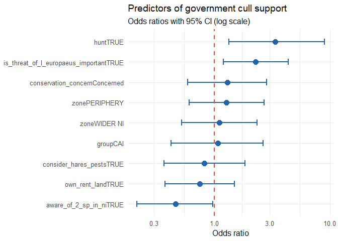
Model fit
cat("AIC:", round(AIC(glm_fit), 1), "\n")## AIC: 261.6cat("Null deviance:", round(glm_fit$null.deviance, 1),
"on", glm_fit$df.null, "df\n")## Null deviance: 262.5 on 199 dfcat("Residual deviance:", round(glm_fit$deviance, 1),
"on", glm_fit$df.residual, "df\n")## Residual deviance: 241.6 on 190 dfcat("McFadden pseudo-R:",
round(1 - glm_fit$deviance / glm_fit$null.deviance, 3), "\n")## McFadden pseudo-R: 0.08Unlike the usual R^2 in linear regression, McFadden’s pseudo-R^2 does not tell you how much of the outcome is “explained” by the model. Instead, it tells you how much better your model fits the data compared to a baseline model with only an intercept. Values around 0.2–0.4 are often considered quite good in social science, but it should be interpreted cautiously rather than taken as a strict measure of model quality.
Which predictors have ORs substantially different from 1.0? Are the
confidence intervals narrow (precise estimates) or wide (high
uncertainty)? How might you improve the model? What would an interaction
between group and aware_of_2_sp_in_ni mean
conceptually?
Thematic analysis of multi-select responses
Theory
Some questions in the survey were multi-select, i.e., respondents could tick all that applied. These cannot be treated as simple binary variables as the combination of choices carries meaning.
In this section we’ll use a qualitative thematic approach. We identify the “themes” (choice profiles) present in the data and examine which groups favour which themes. This allows us to be fully quantitative and use pattern analysis on binary data.
Culling method profiles
cull_mat <- hare |>
  dplyr::select(group, all_of(cull_methods)) |>
  filter(!is.na(shooting) | !is.na(netting) | !is.na(trapping)) |>
  mutate(across(all_of(cull_methods), ~replace_na(as.integer(.), 0L))) |>
  mutate(
    n_methods = shooting + netting + trapping,
    profile   = case_when(
      n_methods == 0              ~ "None selected",
      shooting & !netting & !trapping ~ "Shooting only",
      !shooting & netting & !trapping ~ "Netting only",
      !shooting & !netting & trapping ~ "Trapping only",
      shooting & netting & !trapping  ~ "Shooting + Netting",
      shooting & !netting & trapping  ~ "Shooting + Trapping",
      !shooting & netting & trapping  ~ "Netting + Trapping",
      TRUE                            ~ "All three"
    )
  )

count(cull_mat, group, profile) |> arrange(group, desc(n))
## group profile n
## 1 CAI Shooting only 34
## 2 CAI All three 29
## 3 CAI Netting only 21
## 4 CAI Shooting + Netting 7
## 5 CAI Netting + Trapping 5
## 6 CAI Trapping only 4
## 7 CAI Shooting + Trapping 2
## 8 Public Shooting only 33
## 9 Public Netting only 27
## 10 Public All three 13
## 11 Public Netting + Trapping 10
## 12 Public Trapping only 9
## 13 Public Shooting + Netting 2cull_mat |>
count(group, profile) |>
group_by(group) |>
mutate(pct = n / sum(n) * 100) |>
ggplot(aes(x = pct, y = reorder(profile, pct), fill = group)) +
geom_col(position = position_dodge(0.7), width = 0.65) +
geom_text(aes(label = paste0(round(pct), "%")),
position = position_dodge(0.7), hjust = -0.15, size = 3) +
scale_fill_manual(values = c("CAI" = "#2166ac", "Public" = "#d73027")) +
scale_x_continuous(limits = c(0, 75), labels = percent_format(scale = 1)) +
labs(title = "Preferred culling method combinations",
subtitle = "Multi-select question: tick all that apply",
x = "% respondents", y = NULL, fill = NULL) +
theme_minimal(base_size = 12) +
theme(legend.position = "top")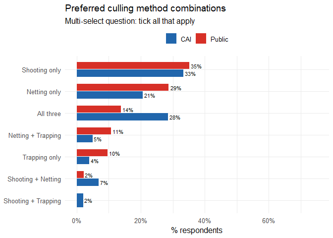
Linking themes to attitudes
We can use chi-square to quantitatively test whether culling method preference differs between groups.
profile_tbl <- table(cull_mat$group, cull_mat$profile)
chisq.test(profile_tbl)
## Warning in stats::chisq.test(x, y, ...): Chi-squared approximation may be
## incorrect##
## Pearson's Chi-squared test
##
## data: profile_tbl
## X-squared = 14.926, df = 6, p-value = 0.02084Activity co-occurrence: the Jaccard index
For the rural activities question, we want to know which activities tend to co-occur, i.e., which activities are commonly practised together. We use the Jaccard similarity index, which measures the overlap between two sets. A Jaccard of 1 means the two activities always occur together; 0 means they never do.
act_mat <- hare |>
  dplyr::select(all_of(activity_cols)) |>
  mutate(across(everything(), ~replace_na(as.integer(.), 0L))) |>
  as.matrix()

co_occur <- t(act_mat) %*% act_mat   # n(i AND j) for all pairs
diag(co_occur) <- 0

n_each      <- colSums(act_mat)
jaccard_mat <- matrix(NA_real_, nrow = ncol(act_mat), ncol = ncol(act_mat),
                      dimnames = list(activity_cols, activity_cols))

for (i in seq_len(ncol(act_mat))) {
  for (j in seq_len(ncol(act_mat))) {
    union_ij          <- n_each[i] + n_each[j] - co_occur[i, j]
    jaccard_mat[i, j] <- if (union_ij > 0) co_occur[i, j] / union_ij else 0
  }
}

round(jaccard_mat, 2)
## hunt game_birds rabbits wildfowl fishing_angling
## hunt 0.00 0.66 0.54 0.54 0.44
## game_birds 0.66 0.00 0.56 0.71 0.53
## rabbits 0.54 0.56 0.00 0.54 0.38
## wildfowl 0.54 0.71 0.54 0.00 0.53
## fishing_angling 0.44 0.53 0.38 0.53 0.00g_act <- graph_from_adjacency_matrix(
jaccard_mat, mode = "undirected", weighted = TRUE, diag = FALSE
)
set.seed(7)
ggraph(g_act, layout = "circle") +
geom_edge_link(aes(width = weight, alpha = weight), colour = "#27ae60") +
geom_node_point(size = 14, colour = "#1a7837", fill = "#a8ddb5",
shape = 21, stroke = 1.5) +
geom_node_text(aes(label = name), size = 3.2, colour = "black") +
scale_edge_width(range = c(0.3, 5), name = "Jaccard") +
scale_edge_alpha(range = c(0.2, 1), guide = "none") +
labs(title = "Co-occurrence of rural activities",
subtitle = "Edge width proportional to Jaccard similarity") +
theme_graph(base_family = "sans")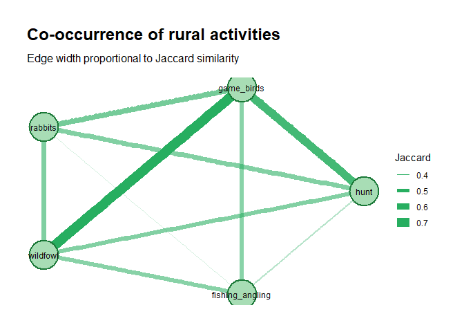
Respondent typology
Finally, we create a simple classification by combining two measures: awareness (how much a respondent knows) and support (how strongly they support active management). This is similar to stakeholder mapping, where people are grouped based on their knowledge and attitudes to help guide conservation decisions.
hare <- hare |>
  mutate(
    awareness_index = as.integer(seen_hares) +
                      as.integer(aware_of_2_sp_in_ni) +
                      as.integer(is_threat_of_l_europaeus_important),

    support_index   = as.integer(support_management_of_l_europaeus) +
                      as.integer(lethal_culling) +
                      as.integer(support_management_via_petition) +
                      as.integer(support_cull_with_direct_involvement) +
                      as.integer(allow_cull_on_land) +
                      as.integer(support_gov_t_cull_decision),

    activity_breadth = as.integer(hunt) + as.integer(game_birds) +
                       as.integer(rabbits) + as.integer(wildfowl) +
                       as.integer(fishing_angling),

    typology = case_when(
      support_index >= 4 & awareness_index >= 2 ~ "Informed advocate",
      support_index >= 4 & awareness_index <  2 ~ "Pragmatic advocate",
      support_index <  2 & awareness_index >= 2 ~ "Aware but opposed",
      support_index <  1 & awareness_index <  1 ~ "Disengaged",
      TRUE                                      ~ "Ambivalent"
    ),
    typology = factor(typology,
                      levels = c("Informed advocate", "Pragmatic advocate",
                                 "Ambivalent", "Aware but opposed", "Disengaged"))
  )

count(hare, group, typology) |> arrange(group, typology)
## group typology n
## 1 CAI Informed advocate 27
## 2 CAI Pragmatic advocate 6
## 3 CAI Ambivalent 83
## 4 CAI Aware but opposed 23
## 5 Public Informed advocate 32
## 6 Public Pragmatic advocate 8
## 7 Public Ambivalent 130
## 8 Public Aware but opposed 31
## 9 Public Disengaged 1It’s important to note that the thresholds used to define these categories are based on subjective judgement rather than fixed rules. This means that different reasonable cut-offs could change how individuals are grouped, so the typology should be interpreted as a useful simplification rather than a precise classification. Where possible, these thresholds should be checked against empirical evidence or validated with expert judgement to ensure they are meaningful and robust.
hare |>
  filter(!is.na(typology)) |>
  count(group, typology) |>
  group_by(group) |>
  mutate(pct = n / sum(n) * 100) |>
  ggplot(aes(x = pct, y = fct_rev(typology), fill = group)) +
  geom_col(position = position_dodge(0.7), width = 0.65) +
  geom_text(aes(label = paste0(round(pct), "%")),
            position = position_dodge(0.7), hjust = -0.1, size = 3.2) +
  scale_fill_manual(values = c("CAI" = "#2166ac", "Public" = "#d73027")) +
  scale_x_continuous(limits = c(0, 75), labels = percent_format(scale = 1)) +
  labs(
    title    = "Respondent typology by group",
    subtitle = "Based on awareness index (0–4) and support index (0–6)",
    x = "% respondents", y = NULL, fill = NULL
  ) +
  theme_minimal(base_size = 12) +
  theme(legend.position = "top")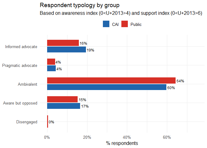
How would you use these typologies in conservation practice? The “informed advocate” already knows and supports so do you need to spend resources on them? The “pragmatic advocate” supports but doesn’t really know why; are they a potential liability if the evidence changes? The “aware but opposed” understand the issue and still say no. What would it take to change their mind, and should you try?
Latent Class Analysis (LCA)
Imagine you have given 341 people a survey with 11 yes/no questions. You now have 341 rows of 1s and 0s. LCA asks whether, beneath all the variation, are there a small number of distinct types of respondent and if so, how many, and what defines each type?
A latent variable is one you cannot observe directly, one that is hidden in the data. In this case, the latent variable is respondent type - the underlying attitude profile that caused a particular person to answer the way they did. LCA tries to recover that hidden structure from the pattern of observed responses.
Previously we created a typology by applying rules designed by us. That is perfectly reasonable, but the thresholds and dimensions are our choices. LCA makes no such assumptions. Instead, it finds the grouping that best explains the observed pattern of responses statistically without requiring us to decide in advance what the groups should look like or how many there should be. The two approaches should broadly agree if your hand-coded typology is capturing something real but where they diverge is informative.
LCA assumes that each respondent belongs to one of K unobserved classes. Within each class, responses to individual questions are assumed to be independent of each other (local independence assumption). This might run counter to your own understanding of the data. You might expect, for example, “supports lethal culling” and “supports a government cull” to be correlated. But LCA suggests that they are only correlated because they are both influenced by the same underlying class membership. Once you know which class someone belongs to, knowing their answer to one question tells you nothing extra about their answer to another. The class explains the correlation.
The model estimates:
- Class proportions. I.e., what fraction of the population belongs to each class. If K = 3, you might get classes of 45%, 35%, and 20%.
- Item response probabilities. I.e., for each class and each question, the probability that a member of that class answers “Yes”. A class with P(lethal culling = Yes) = 0.92 is very different from one with P(lethal culling = Yes) = 0.18.
# poLCA requires indicators coded as positive integers starting at 1.
# Our binary columns are TRUE/FALSE — add 1L to make them 1/2.

lca_vars <- c(
  "seen_l_europaeus", "aware_of_2_sp_in_ni",
  "is_threat_of_l_europaeus_important", "consider_hares_pests",
  "support_management_of_l_europaeus", "habitat_management_for_l_t_hibernicus",
  "lethal_culling", "support_management_via_petition",
  "support_cull_with_direct_involvement", "allow_cull_on_land",
  "support_gov_t_cull_decision"
)

lca_df <- hare |>
  dplyr::select(all_of(lca_vars)) |>
  mutate(across(everything(), ~ as.integer(.) + 1L)) |>  # FALSE→1, TRUE→2
  drop_na()

# poLCA needs a formula listing all indicators
lca_formula <- as.formula(
  paste("cbind(", paste(lca_vars, collapse = ","), ") ~ 1")
)

# Choose the number of classes
# Fit models with 2–5 classes and compare AIC / BIC.
# BIC tends to favour more parsimonious solutions; AIC can overfit slightly.

fit_lca <- function(k) {
  poLCA(lca_formula, data = lca_df, nclass = k,
        maxiter = 3000, tol = 1e-6,
        verbose = FALSE, nrep = 10)   # nrep: 10 random starts, keeps best
}

set.seed(42)
models <- map(2:5, fit_lca)

# Model fit table
fit_table <- tibble(
  K      = 2:5,
  logLik = map_dbl(models, ~ .x$llik),
  AIC    = map_dbl(models, ~ .x$aic),
  BIC    = map_dbl(models, ~ .x$bic),
  df     = map_int(models, ~ .x$resid.df)
)
print(fit_table)
## # A tibble: 4 × 5
## K logLik AIC BIC df
## <int> <dbl> <dbl> <dbl> <int>
## 1 2 -839. 1724. 1794. 127
## 2 3 -812. 1694. 1800. 115
## 3 4 -789. 1672. 1813. 103
## 4 5 -772. 1662. 1840. 91# Scree-style plot of BIC
ggplot(fit_table, aes(x = K, y = BIC)) +
geom_line(linewidth = 1, colour = "#2166ac") +
geom_point(size = 3, colour = "#2166ac") +
geom_line(aes(y = AIC), linewidth = 1, colour = "#d73027", linetype = "dashed") +
geom_point(aes(y = AIC), size = 3, colour = "#d73027") +
labs(title = "LCA model selection",
subtitle = "Lower BIC (blue)/ AIC(red) = better fit; look for the elbow",
x = "Number of latent classes (K)", y = "Information criterion") +
theme_minimal(base_size = 12)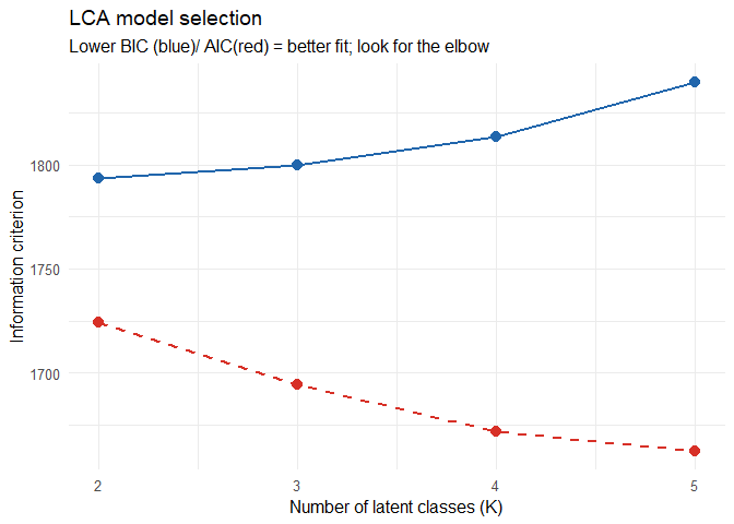
# Select and label the best model
best_model <- models[[2]]   # models[[1]] = K=2, models[[2]] = K=3, etc.
K <- length(unique(best_model$predclass))
cat("Using K =", K, "classes\n")
## Using K = 3 classesFor this example we manually select K = 3 to illustrate interpretation. In practice, K should be chosen empirically based on the BIC/AIC and the point at which adding another class produces diminishing returns in fit.
To use the empirically best model instead, replace the line above with:
best_model <- models[[which.min(map_dbl(models, ~ .x$bic)) ]]
K <- length(unique(best_model$predclass))
cat("Best K by BIC:", K, "\n")
# Extract item response probabilities
# probs[[item]][class, response] — we want response = 2 (TRUE)
probs_df <- imap_dfr(best_model$probs, function(mat, item) {
tibble(
item = item,
class = paste0("Class ", seq_len(nrow(mat))),
prob = mat[, 2] # probability of YES (response = 2)
)
})
# Readable item labels
item_labels <- c(
seen_l_europaeus = "Seen European hare",
aware_of_2_sp_in_ni = "Aware of 2 species",
is_threat_of_l_europaeus_important = "Threat important",
consider_hares_pests = "Hares are pests",
support_management_of_l_europaeus = "Support management",
habitat_management_for_l_t_hibernicus = "Habitat management",
lethal_culling = "Lethal culling",
support_management_via_petition = "Sign petition",
support_cull_with_direct_involvement = "Direct involvement",
allow_cull_on_land = "Allow cull on land",
support_gov_t_cull_decision = "Support govt cull"
)
probs_df <- probs_df |>
mutate(item = factor(item_labels[item], levels = rev(item_labels)))
# ── Step 4: item probability plot ────────────────────────────────────────────
ggplot(probs_df, aes(x = prob, y = item, colour = class)) +
geom_point(size = 3.5, alpha = 0.9) +
geom_line(aes(group = class), linewidth = 0.8, alpha = 0.6,
orientation = "y") +
geom_vline(xintercept = 0.5, linetype = "dashed", colour = "grey50") +
scale_x_continuous(labels = percent_format(), limits = c(0, 1)) +
scale_colour_brewer(palette = "Set1") +
labs(title = "LCA item response probabilities by class",
subtitle = "Each point = P(Yes) for that item in that class · dashed = 50%",
x = "Probability of Yes response", y = NULL, colour = NULL) +
facet_wrap(~ class, nrow = 1) +
theme_minimal(base_size = 12) +
theme(legend.position = "none",
panel.spacing = unit(1.2, "lines"))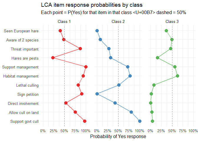
This is the most important output. Each panel is one latent class. Each point is one survey question. The x-axis shows P(Yes) for that question within that class. What we are looking for:
- The dashed line at 50% is a natural reference: above it means the class is more likely than not to say Yes; below means more likely to say No
- Classes that separate cleanly on the management questions represent genuinely different attitude profiles.
- A class with high awareness but low management support is the “Aware but opposed” group found without any prior assumptions. If this matches our hand-coded typology, that is a form of validation
- Questions where all classes overlap near 0.5 are not driving the class structure. They are not discriminating between types and you could consider removing them in a revised model.
Once the model is fitted, each respondent gets a posterior probability of belonging to each class. We can then cross-tabulate class membership against external variables such as group (CAI vs Public), zone, or cull support that were not used in the LCA itself. This is how we validate the classes. If Class 1 turns out to be 89% CAI members, that is not a finding we forced on the data, it is something the analysis revealed.
# Posterior probabilities
K <- length(unique(best_model$predclass))

hare_lca <- hare |>
  drop_na(all_of(lca_vars)) |>
  mutate(
    pred_class = factor(best_model$predclass,
                        labels = paste0("Class ", 1:K)),
    entropy    = -rowSums(best_model$posterior *
                            log(best_model$posterior + 1e-10))
  )

# Table helper
# Produces a tidy row/column % table for any grouping variable
cross_tab <- function(var, label) {
  hare_lca |>
    filter(!is.na(.data[[var]])) |>
    count(pred_class, .data[[var]]) |>
    group_by(pred_class) |>
    mutate(row_pct = round(n / sum(n) * 100, 1)) |>
    ungroup() |>
    rename(category = 2) |>
    mutate(variable = label)
}

# Class sizes and assignment certainty
tibble(
  class        = paste0("Class ", 1:K),
  n            = tabulate(best_model$predclass),
  pct          = round(tabulate(best_model$predclass) /
                         nrow(hare_lca) * 100, 1),
  mean_post    = round(map_dbl(1:K, ~
                   mean(best_model$posterior[best_model$predclass == .x, .x])),
                   3),
  mean_entropy = round(map_dbl(1:K, ~
                   mean(hare_lca$entropy[best_model$predclass == .x])),
                   3)
)|> print()
## # A tibble: 3 × 5
## class n pct mean_post mean_entropy
## <chr> <int> <dbl> <dbl> <dbl>
## 1 Class 1 49 32.7 0.988 0.032
## 2 Class 2 19 12.7 0.905 0.241
## 3 Class 3 82 54.7 0.989 0.029# mean_post close to 1.0 = respondents clearly belong to that class
# mean_entropy close to 0 = low ambiguity in assignmentMean posterior probability is how we report assignment quality. A value of 0.91 means that, on average, respondents assigned to that class had a 91% posterior probability of belonging to it — high certainty. Values below 0.70 suggest the class boundaries are fuzzy and K may be too large.
# Class × respondent group
table(hare_lca$pred_class, hare_lca$group) |>
  prop.table(margin = 1) |>
  round(2) |>
  print()
##
## CAI Public
## Class 1 0.43 0.57
## Class 2 0.11 0.89
## Class 3 0.34 0.66# Class × government cull support
table(hare_lca$pred_class, hare_lca$support_gov_t_cull_decision) |>
prop.table(margin = 1) |>
round(2) |>
print()##
## FALSE TRUE
## Class 1 0.02 0.98
## Class 2 0.00 1.00
## Class 3 0.96 0.04# Class × conservation concern
table(hare_lca$pred_class, hare_lca$conservation_concern) |>
prop.table(margin = 1) |>
round(2) |>
print()##
## Not concerned Concerned
## Class 1 0.10 0.90
## Class 2 0.44 0.56
## Class 3 0.20 0.80# Class × typology (validates against hand-coded types)
table(hare_lca$pred_class, hare_lca$typology) |>
prop.table(margin = 1) |>
round(2) |>
print()##
## Informed advocate Pragmatic advocate Ambivalent Aware but opposed
## Class 1 0.71 0.12 0.16 0.00
## Class 2 0.16 0.32 0.53 0.00
## Class 3 0.00 0.00 0.35 0.65
##
## Disengaged
## Class 1 0.00
## Class 2 0.00
## Class 3 0.00# Are class differences statistically significant
# Chi-square tests: class × external variables ===\n")
ext_vars <- c("group", "zone", "conservation_concern",
"support_gov_t_cull_decision")
map_dfr(ext_vars, function(v) {
tbl <- table(hare_lca$pred_class, hare_lca[[v]])
test <- chisq.test(tbl)
tibble(
variable = v,
chi_sq = round(test$statistic, 2),
df = test$parameter,
p_value = round(test$p.value, 4),
sig = case_when(test$p.value < 0.001 ~ "***",
test$p.value < 0.01 ~ "**",
test$p.value < 0.05 ~ "*",
TRUE ~ "ns")
)
}) |> print()## # A tibble: 4 × 5
## variable chi_sq df p_value sig
## <chr> <dbl> <int> <dbl> <chr>
## 1 group 6.38 2 0.0412 *
## 2 zone 1.68 4 0.795 ns
## 3 conservation_concern 8.13 2 0.0172 *
## 4 support_gov_t_cull_decision 134. 2 0 ***# Visualise all cross-tabulations in one panel plot
plot_cross <- function(var, label, data = hare_lca) {
data |>
filter(!is.na(.data[[var]])) |>
mutate(category = as.character(.data[[var]])) |>
count(pred_class, category) |>
group_by(pred_class) |>
mutate(pct = n / sum(n) * 100) |>
ggplot(aes(x = pct, y = pred_class, fill = category)) +
geom_col(width = 0.6) +
scale_x_continuous(labels = percent_format(scale = 1)) +
scale_fill_brewer(palette = "Set2") +
labs(title = label, x = NULL, y = NULL, fill = NULL) +
theme_minimal(base_size = 11) +
theme(legend.position = "bottom",
legend.text = element_text(size = 8),
plot.title = element_text(size = 11, face = "bold"))
}
p1 <- plot_cross("group", "Respondent group")
p2 <- plot_cross("zone", "Geographic zone")
p3 <- plot_cross("conservation_concern", "Conservation concern")
p4 <- plot_cross("support_gov_t_cull_decision", "Supports government cull")
(p1 + p2) / (p3 + p4) +
plot_annotation(
title = "Latent class composition: external variable cross-tabulations",
subtitle = "Variables not used in the LCA — patterns here are data-driven, not assumed",
theme = theme(plot.title = element_text(size = 13, face = "bold"),
plot.subtitle = element_text(size = 10, colour = "grey40"))
)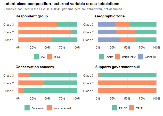
From these metrics and the plot we get a ‘portrait’ of each class.
- Class 1 is split is relatively even (43% CAI, 57% Public), so this class is not defined by organisational membership. What defines it is attitude: 98% support the government cull, and 90% are concerned about conservation. The typology table confirms this — 71% fall into our hand-coded “Informed advocate” category. These are people who know about the issue, care about it, and back action. They are distributed across both groups, which suggests that genuine ecological concern, rather than field sports culture, is the driver.
- Class 2 is overwhelmingly Public respondents (89%) and every single one of them supports the government cull (100% TRUE), yet they are the least conservationally engaged (44%), and 53% fall into our “Ambivalent” typology category with another 32% as “Pragmatic advocates.” This is the group that supports culling but perhaps not for conservation reasons. This is an important finding as it means a sizeable share of public support for culls is rather like a shallow lake: wide enough to look impressive on the map, but only ankle-deep once you step into it.
- Class 3 is 96% opposed to the government cull. It is mostly Public respondents (66%) and 65% map onto our “Aware but opposed” typology, with the remaining 35% ambivalent. Crucially, 80% are still concerned about conservation, so this is not indifference. These are people who care about wildlife but do not support this particular management intervention. They are not the disengaged public; they are the sceptical public. Persuading them would require engaging with their specific objections to lethal control, not simply raising awareness of the problem.
Bear in mind that class labels are arbitrary. Class 1 in one run might be Class 3 in another. The profiles are stable; the numbers are not. Always describe classes by their characteristics, not their numbers.
Summary
- Descriptive statistics established that the CAI and Public samples have quite different activity profiles and conservation awareness levels, setting up the need for group-level comparisons.
- Chi-square tests and Fisher’s exact test revealed statistically significant group differences on most management variables, which survived Bonferroni correction.
- Phi coefficients and the association network showed that management support variables cluster tightly together, and that awareness variables are somewhat distinct, suggesting that “knowing” and “supporting” are not the same thing.
- Logistic regression identified which predictors independently predict support for a government cull, controlling for all other factors in the model.
- Thematic coding showed that shooting alone is the most common single-method prefered for lethal control, but the combination of methods differs between groups.
- LCA showed that while support for a cull is numerically strong, any management communication strategy that treats all supporters as equivalent, or all opponents as simply uninformed, is misreading the data and may be doomed to fail.
Tutorial based on data from Caravaggi A, Montgomery WI, Reid N (2017), Biology & Environment 117B:53–63, https://doi.org/10.3318/bioe.2017.08. Dataset: https://zenodo.org/records/891251 (CC BY 4.0).