Welcome to Module 3
So far, we’ve looked at data. Now we’re going to start seeing it.
Numbers on their own are hard to interpret. A column of 300 values doesn’t naturally tell you a story. But a simple plot often does. Visualisation is often the fastest way to understand what’s going on. Before you start running tests or calculating anything complicated, a good plot can tell you:
Before we calculate anything complicated, it’s usually worth asking:
- Are values spread out or tightly grouped?
- Are groups different?
- Do two variables move together?
Plotting data helps you answer questions like these. By the end of this module, you will be able to:
- Create scatterplots, histograms, and boxplots
- Understand what each type of plot shows
- Begin spotting patterns in data
Histograms, or, ‘what does this variable look like?’
A histogram shows how values are distributed.
hist(penguins$bill_length_mm,
     main = "Distribution of Bill Length",
     xlab = "Bill Length (mm)",
     col = "skyblue",
     border = "white")
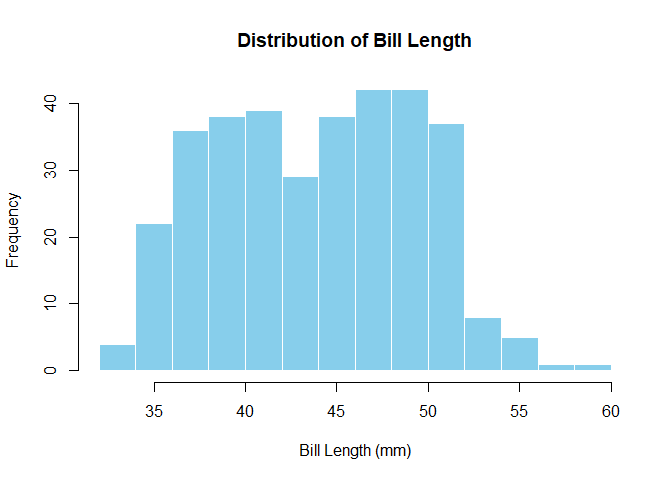
What to look for:
- Where are most values?
- Is the distribution symmetrical or skewed (i.e., larger on one side than the other)?
- Are there any unusual values?
Boxplots — comparing groups
Boxplots are useful when you want to compare groups.
boxplot(bill_length_mm ~ species,
        data = penguins,
        main = "Bill Length by Species",
        ylab = "Bill Length (mm)",
        col = c("lightpink","lightgreen","lightblue"))
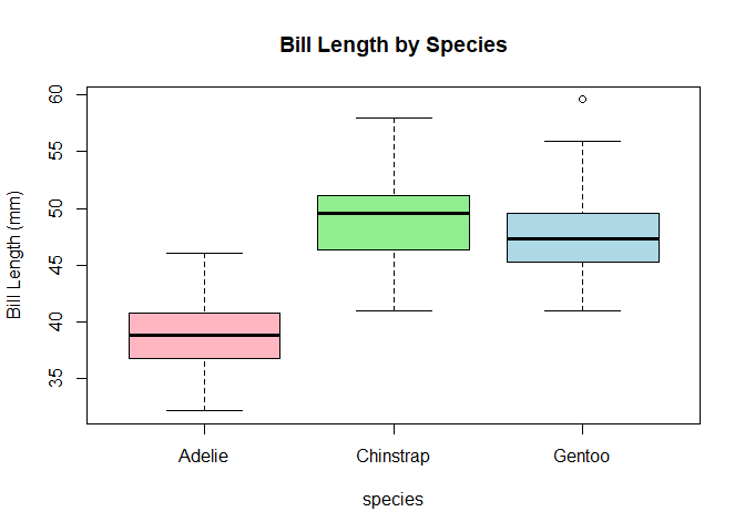
Each box represents one group (here, a species of penguin). Things to look for:
- The middle line (median): where is the centre of each group?
- The height of the box: how spread out are the values?
- Any points outside the lines: potential outliers
At this stage, don’t worry about whether differences are “significant”. Just ask whether groups look different.
Scatterplots — relationships between variables
Scatterplots show the relationship between two variables. Each point is one observation (one penguin, in this case).
Here, we’re asking: “As one variable changes, what happens to the other?”
plot(penguins$flipper_length_mm,
     penguins$body_mass_g,
     main = "Flipper Length vs Body Mass",
     xlab = "Flipper Length (mm)",
     ylab = "Body Mass (g)",
     pch = 19,
     col = "steelblue")
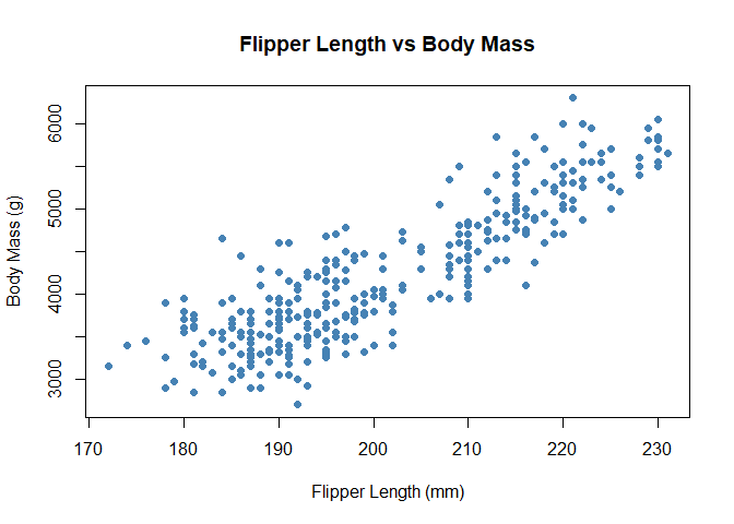
Look for:
- An upward trend (as one increases, so does the other)
- A downward trend (one increases while the other decreases)
- No clear pattern (the variables might not be related)
You’re not calculating anything yet — just noticing patterns.
Adding colour (optional but useful)
Sometimes patterns aren’t obvious until you add a bit more information.
species is already a factor (a categorical variable), which is great
for analysis. When we produce basic plot, however, R needs numbers to
map to colours, not category names (this changes with more advanced
plotting packages but more on that, later). We convert the factor into
numbers using as.numeric(), which lets R assign a different colour to
each group:
cols <- as.numeric(penguins$species)

plot(penguins$flipper_length_mm,
     penguins$body_mass_g,
     col = cols,
     pch = 19,
     xlab = "Flipper Length (mm)",
     ylab = "Body Mass (g)",
     main = "Flipper Length vs Body Mass (by Species)")
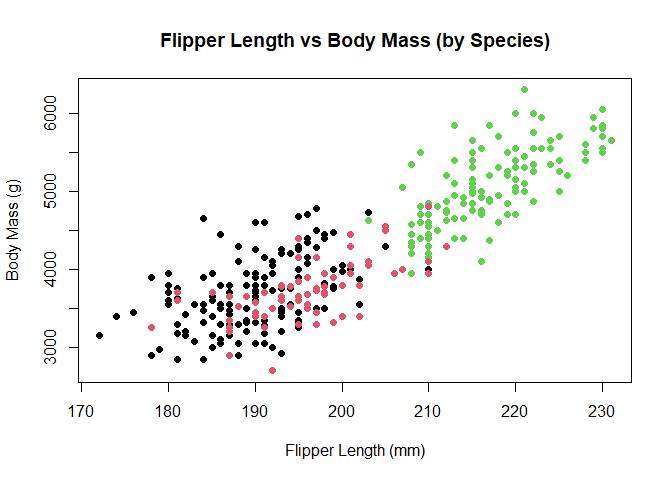
Now the plot tells a richer story. Instead of one cloud of points, you may start to see clusters. Intelligent use of colour can reveal patterns in the data.
Why this matters
Plots are not just for presentation — they’re an important part of thinking about data. Plots help you:
- Understand your data before analysing it
- Spot patterns and relationships
- Catch problems early (like outliers or strange values)
Before doing any statistical test, it’s good practice to Look at your data before you test it.
Lessons learned
- Histograms show distributions
- Boxplots compare groups
- Scatterplots show relationships *Visualisation helps you understand data before analysing it