Welcome to module 4
Now that we can look at penguin data and visualise them, it’s time to summarise our data numerically. Descriptive statistics help us answer questions like:
- What’s a “typical” value?
- How much do values vary (differ)?
- How confident are we about the average value of our sample? Does it accurately reflect the population?
Think of this as learning the language of the data before asking bigger questions.
Prepare your dataset
Notice that we’re now using an additional package, ggplot2. This supports more sophisticated plots and makes it easier to construct high-quality figures.
library(palmerpenguins)
library(ggplot2)

data("penguins")

# Remove only the missing values for columns we need
penguins_clean <- penguins[!is.na(penguins$bill_length_mm) &
                            !is.na(penguins$species) &
                            !is.na(penguins$body_mass_g), ]
Here, the square brackets mean ‘look inside this thing’. Square brackets support indexing with rows separated from columns by a comma. So:
penguins_clean[1,]
## # A tibble: 1 × 8
##   species island    bill_length_mm bill_depth_mm flipper_length_mm body_mass_g sex    year
##   <fct>   <fct>              <dbl>         <dbl>             <int>       <int> <fct> <int>
## 1 Adelie  Torgersen           39.1          18.7               181        3750 male   2007
…gives you row 1. Similarly,
penguins_clean[,1]
## # A tibble: 342 × 1
##    species
##    <fct>
##  1 Adelie
##  2 Adelie
##  3 Adelie
##  4 Adelie
##  5 Adelie
##  6 Adelie
##  7 Adelie
##  8 Adelie
##  9 Adelie
## 10 Adelie
## # ℹ 332 more rows
…gives you column one. And,
penguins_clean[1,1]
## # A tibble: 1 × 1
##   species
##   <fct>
## 1 Adelie
…gives you the cell found at row 1, column 1. You can use more complicated arguments to extract multiple values using an array argument : for concurrent data or c() for non-concurrent data. If that sounds like complete gibberish:
penguins_clean[,2:5]
## # A tibble: 342 × 4
##    island    bill_length_mm bill_depth_mm flipper_length_mm
##    <fct>              <dbl>         <dbl>             <int>
##  1 Torgersen           39.1          18.7               181
##  2 Torgersen           39.5          17.4               186
##  3 Torgersen           40.3          18                 195
##  4 Torgersen           36.7          19.3               193
##  5 Torgersen           39.3          20.6               190
##  6 Torgersen           38.9          17.8               181
##  7 Torgersen           39.2          19.6               195
##  8 Torgersen           34.1          18.1               193
##  9 Torgersen           42            20.2               190
## 10 Torgersen           37.8          17.1               186
## # ℹ 332 more rows
penguins_clean[,c(2,5)]
## # A tibble: 342 × 2
##    island    flipper_length_mm
##    <fct>                 <int>
##  1 Torgersen               181
##  2 Torgersen               186
##  3 Torgersen               195
##  4 Torgersen               193
##  5 Torgersen               190
##  6 Torgersen               181
##  7 Torgersen               195
##  8 Torgersen               193
##  9 Torgersen               190
## 10 Torgersen               186
## # ℹ 332 more rows
The first argument returns all of columns 1 to 5. The second only returns columns 2 and 5.
penguins_clean <- penguins[!is.na(penguins$bill_length_mm) &
                            !is.na(penguins$species) &
                            !is.na(penguins$body_mass_g), ]
So here we’re looking within penguins and excluding rows (using !is.na()) where there are NAs in the columns bill_length_mm, ‘species’, and ’body_mass_g`. We are not selecting so are including them all.
Measures of central tendency
Mean — the “typical” value
mean(penguins_clean$bill_length_mm)
## [1] 43.92193
The mean is the foundation for most statistical tests like t-tests and regression. It has mathematical properties that make differences and variation easy to compute. Later, we’ll build everything from this anchor.
Median — the middle value
median(penguins_clean$bill_length_mm)
## [1] 44.45
The median is the value in the middle of the sorted data. Unlike the mean, it’s robust to extreme values.
Spread — how much the data varies
Standard deviation (SD)
sd(penguins_clean$bill_length_mm)
## [1] 5.459584
The Standard Deviation:
- Shows the typical distance of a given data point from the mean (i.e., the spread of the data)
- Small SD = tightly clustered; large SD = spread out.
Standard error (SE)
se <- sd(penguins_clean$bill_length_mm) / sqrt(length(penguins_clean$bill_length_mm))
se
## [1] 0.2952205
The Standard Error is computed by dividing the SD by the square root of the number of measurements in the sample. It shows us how accurately we can estimate the true average of the whole population based on our sample.
- Smaller SE = more confidence in the mean (i.e., our sample mean is close(r) to the population mean)
95% confidence interval (CI)
mean_val <- mean(penguins_clean$bill_length_mm)
ci_lower <- mean_val - 1.96 * se
ci_upper <- mean_val + 1.96 * se
c(ci_lower, ci_upper)
## [1] 43.34330 44.50056
The CI gives a plausible range for the true population mean. We typically use the 95% threshold as this corresponds with our statistical probability threshold of p = 0.05. It basically indicates that if we repeated the study many times, around 95% of all calculated intervals would contain the true mean.
When to use SD, SE, CI
| Measure | What it tells you | When to use |
|---|---|---|
| SD | Spread of raw data | Understanding variability |
| SE | Precision of the mean | Comparing sample means |
| 95% CI | Range of true mean | Reporting uncertainty |
Visual comparison
The code below may seem daunting but we’ll cover ggplot in more detail later. For now, just notice the way in which plots can be built in this system by adding elements and using consistent language.
set.seed(123)
x <- rnorm(30, mean = 40, sd = 5)

mean_x <- mean(penguins_clean$body_mass_g)
sd_x <- sd(penguins_clean$body_mass_g)
se_x <- sd_x / sqrt(length(penguins_clean$body_mass_g))
ci_x <- c(mean_x - 1.96*se_x, mean_x + 1.96*se_x)


# Create a data frame for plotting whiskers
plot_df <- data.frame(
  measure = c("SD", "SE", "95% CI"),
  lower = c(mean_x - sd_x, mean_x - se_x, ci_x[1]),
  upper = c(mean_x + sd_x, mean_x + se_x, ci_x[2])
)

# Plot
ggplot(plot_df, aes(x = measure)) +
  geom_point(aes(y = mean_x), size = 3, color = "blue") +          # Mean as point
  geom_errorbar(aes(ymin = lower, ymax = upper), width = 0.2, color = "red") +
  labs(title = "Mean with SD, SE, and 95% CI Whiskers",
       y = "Body mass (g)", x = "Measure") +
  theme_minimal() +
  geom_hline(yintercept = mean_x, linetype = "dashed", color = "blue") +
    # Annotations
  annotate("text", x = 2.3, y = mean_x[1],
           label = "SD = data spread \n around mean", color = "black", size = 3.5, hjust = 0.5) +
  annotate("text", x = 3.4, y = mean_x[1],
           label = "SE = accuracy \n of mean \n estimate", color = "black", size = 3.5, hjust = 0.5) +
  annotate("text", x = 1.4, y = mean_x[1],
           label = "95% CI = likely \n range for true mean", color = "black", size = 3.5, hjust = 0.5) +

  annotate("text", x = 0.5, y = mean_x + 50, label = "Mean", color = "blue", hjust = 0)
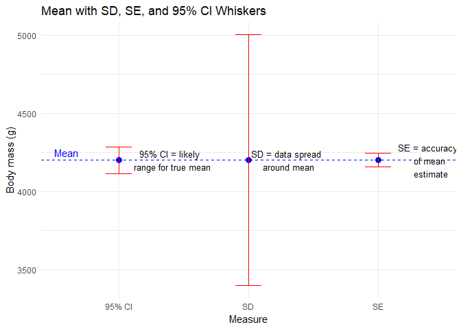
You’ll notice that these estimates are for all penguins. This might be an issue…
Summarising by species
Before we start comparing penguins’ measurements statistically, it helps to look at each group separately. Why? Because treating all penguins as one giant lump ignores the fact that there may be important differences between species.
Summarising by group lets us see patterns and differences visually and numerically, which is exactly what statisticians do before running formal tests.
Let’s calculate the mean bill length for each species:
tapply(penguins_clean$bill_length_mm,
       penguins_clean$species,
       function(x) mean(x, na.rm = TRUE))
##    Adelie Chinstrap    Gentoo
##  38.79139  48.83382  47.50488
What’s happening here:
tapply()splits the data into groups — here, by species.- The anonymous function
function(x) mean(x, na.rm = TRUE)calculates the mean of each group, ignoring missing values. - The result is a small summary table showing average bill length per species.
You can also summarise multiple statistics at once:
aggregate(bill_length_mm ~ species, data = penguins_clean,
          FUN = function(x) c(mean = mean(x), sd = sd(x), n = length(x)))
##     species bill_length_mm.mean bill_length_mm.sd bill_length_mm.n
## 1    Adelie           38.791391          2.663405       151.000000
## 2 Chinstrap           48.833824          3.339256        68.000000
## 3    Gentoo           47.504878          3.081857       123.000000
Now we get the mean and SD for bill length and sample size per species in one glance. This gives a preview of what later t-tests or GLMs will formally test.
We can also adjust our plot from earlier to make it more meaningful.
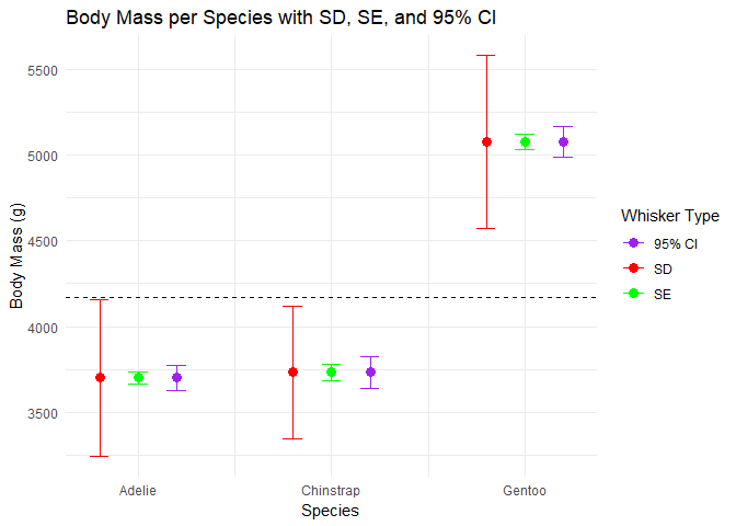
- Compare the means across species: are they very different?
- Look at the SDs: which species’ measurements are more variable?
- Which species estimate has the greatest precision?
By summarising by species, we’re building a clear picture of the data landscape. Later, when we run statistical tests, we’ll already have a solid understanding of our data.
Lessons learned
- Mean is central for later tests
- Median shows the middle value
- SD measures spread of data
- SE measures precision of the mean
- 95% CI gives a plausible range for the true mean
- Plotting these together helps visualize differences
- Always summarise groups separately before testing