Assessing and predicting your SDM
For this module, you’ll need the following packages:
sfterrageodataPresenceAbsenceAUCRColorBrewerlattice
In Module 9 we built a GLM-based species distribution model for the mantled howler monkey. But fitting a model is only half the job. A model that runs without errors isn’t necessarily a good model; it might be capturing noise rather than ecological signal, or systematically wrong in ways that only become apparent when you look at its predictions spatially.
This module covers the remaining two steps: model assessment (how well does it perform?) and prediction (what does it say about the landscape?).
Load your data
load('data/region.RData')
load('data/module9_sdm.RData')
env_stack <- terra::rast('data/env_stack.tif')

# Refit the final model in case it's not in your environment
m_step <- step(
  glm(
    as.formula(paste0(
      "occ ~ ", p1, " + I(", p1, "^2) + ",
                 p2, " + I(", p2, "^2)"
    )),
    family = 'binomial',
    data   = howler_sdm
  )
)
## Start: AIC=645.63
## occ ~ bio10 + I(bio10^2) + bio18 + I(bio18^2)
##
## Df Deviance AIC
## - I(bio10^2) 1 635.64 643.64
## - bio10 1 635.64 643.64
## - bio18 1 635.75 643.75
## - I(bio18^2) 1 635.78 643.78
## <none> 635.63 645.63
##
## Step: AIC=643.64
## occ ~ bio10 + bio18 + I(bio18^2)
##
## Df Deviance AIC
## - bio18 1 635.76 641.76
## - I(bio18^2) 1 635.81 641.81
## <none> 635.64 643.64
## - bio10 1 645.55 651.55
##
## Step: AIC=641.76
## occ ~ bio10 + I(bio18^2)
##
## Df Deviance AIC
## - I(bio18^2) 1 635.95 639.95
## <none> 635.76 641.76
## - bio10 1 645.77 649.77
##
## Step: AIC=639.95
## occ ~ bio10
##
## Df Deviance AIC
## <none> 635.95 639.95
## - bio10 1 650.62 652.62Visualising the species-environment relationship
Before assessing performance, it’s worth seeing what the model has actually learned. Partial response curves show how predicted occurrence probability changes along each predictor variable, while all other variables are held at their mean.
par(mfrow = c(1, 2))

for (pred in my_preds) {
  newdat        <- data.frame(
    x = seq(min(howler_sdm[[pred]]), max(howler_sdm[[pred]]), length = 100)
  )
  names(newdat) <- pred

  other         <- setdiff(my_preds, pred)
  newdat[[other]] <- mean(howler_sdm[[other]], na.rm = TRUE)

  newdat$prob <- predict(m_step, newdata = newdat, type = 'response')

  plot(newdat[[pred]], newdat$prob,
       type = 'l', lwd = 2, col = "tomato",
       xlab = pred, ylab = "Occurrence probability",
       ylim = c(0, 1),
       main = paste("Partial response:", pred))
  abline(h = 0.5, lty = 2, col = 'grey60')
  rug(howler_sdm[[pred]][howler_sdm$occ == 1], col = "tomato", alpha = 0.3)
  rug(howler_sdm[[pred]][howler_sdm$occ == 0], side = 3, col = "grey60", alpha = 0.2)
}
## Warning in axis(side = side, at = at, labels = labels, ...): "alpha" is not a
## graphical parameter
## Warning in axis(side = side, at = at, labels = labels, ...): "alpha" is not a
## graphical parameter
## Warning in axis(side = side, at = at, labels = labels, ...): "alpha" is not a
## graphical parameter
## Warning in axis(side = side, at = at, labels = labels, ...): "alpha" is not a
## graphical parameter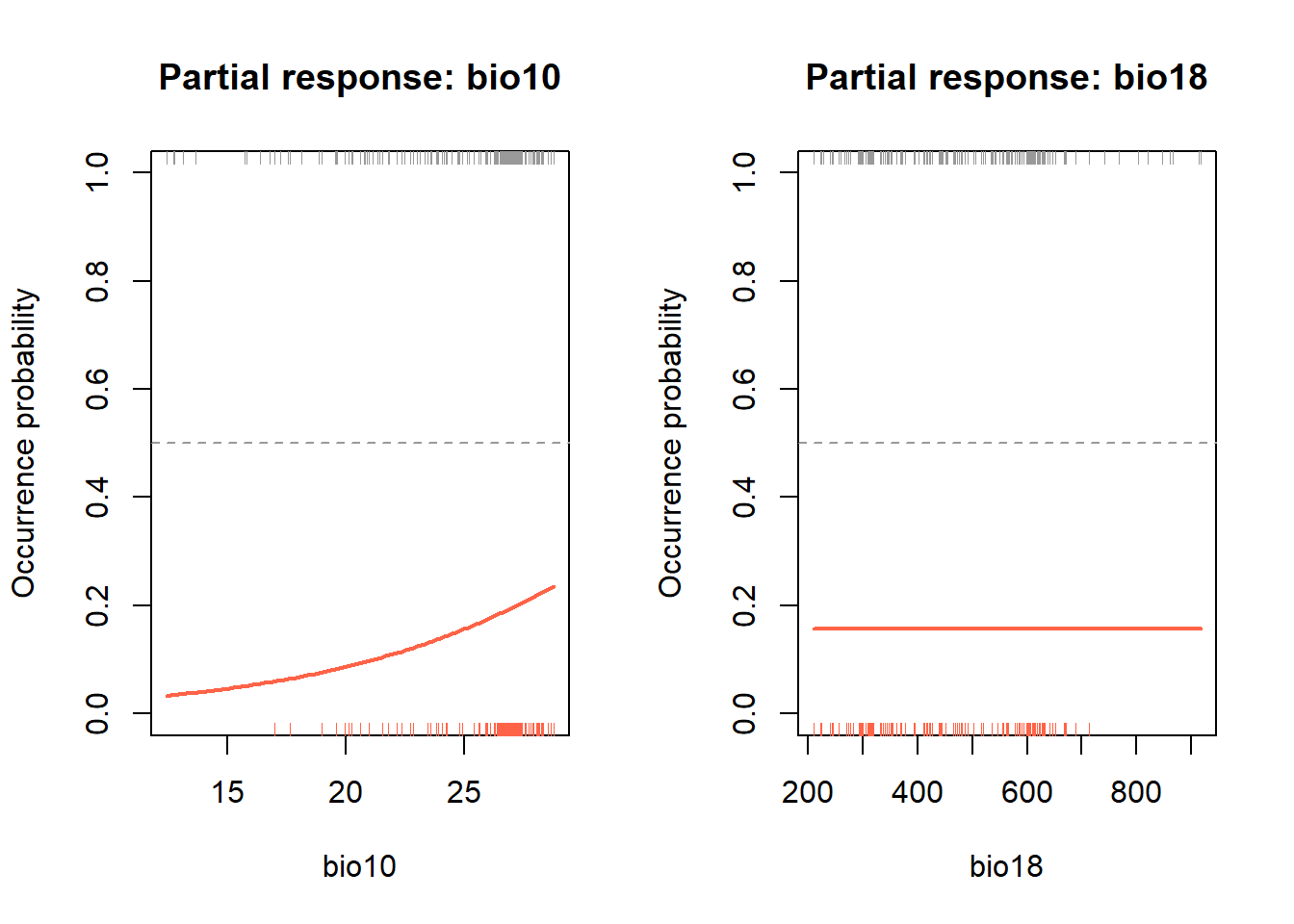
par(mfrow = c(1, 1))The rug() calls add tick marks along the x-axis showing
where actual presence (bottom, red) and background (top, grey) values
fall. This lets you see not just the shape of the model’s prediction,
but also whether it’s being asked to predict outside the range of
training data.
Look at the curve shapes. Is the response monotonic (always increasing or decreasing), or unimodal (peaks at an intermediate value)? Does this match what you’d expect biologically for a lowland tropical primate?
Cross-validation
Explained deviance measures how well the model fits the data it was trained on. Cross-validation gives us a more honest picture by testing the model on data it hasn’t seen. We use 5-fold cross-validation to explore the performance of our model. This splits the data into 5 equal groups (folds), fit the model on 4 folds, predict to the 5th, and cycle through all 5 combinations so every observation gets a turn in the test set.
set.seed(123)
k        <- 5
folds    <- sample(rep(1:k, length.out = nrow(howler_sdm)))
preds_cv <- numeric(nrow(howler_sdm))

for (i in 1:k) {
  train <- howler_sdm[folds != i, ]
  test  <- howler_sdm[folds == i, ]

  m_cv  <- glm(formula(m_step), family = 'binomial', data = train)
  preds_cv[folds == i] <- predict(m_cv, newdata = test, type = 'response')
}
How do cross-validated predictions compare to the training fit?
plot(m_step$fitted.values, preds_cv,
     xlab = 'Fitted values (training)',
     ylab = 'Cross-validated predictions',
     pch = 19, cex = 0.4,
     col = adjustcolor("steelblue", alpha.f = 0.4),
     main = "Training vs cross-validated predictions")
abline(0, 1, col = 'red', lwd = 2)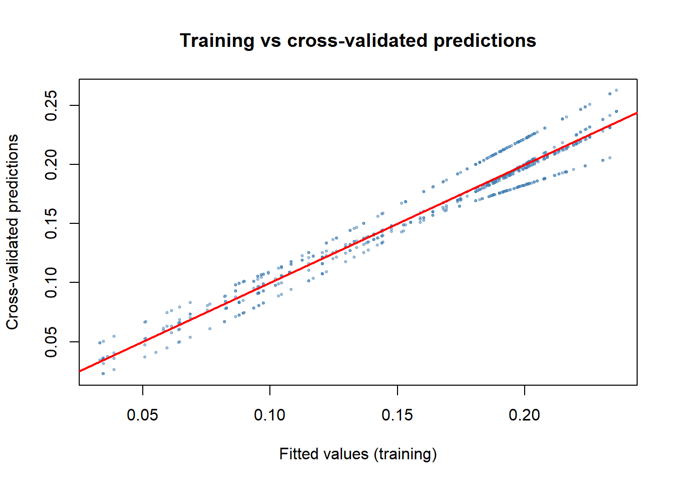
A well-behaved model has points clustered around the 1:1 line. If cross-validated predictions are systematically lower or more variable than training predictions, the model is sensitive to training observations, i.e., is overfitted or unstable.
Performance metrics
Threshold-dependent metrics
Our model predicts a continuous probability. Many performance metrics require a binary prediction (present/absent), so we need to choose a threshold to convert probabilities. This choice is not trivial. A low threshold calls more absences as presences (high sensitivity, low specificity); a high threshold does the opposite.
library(PresenceAbsence)

thresh_dat <- data.frame(
  ID   = seq_len(nrow(howler_sdm)),
  obs  = howler_sdm$occ,
  pred = preds_cv
)

thresh_cv <- PresenceAbsence::optimal.thresholds(DATA = thresh_dat)
## Warning in PresenceAbsence::optimal.thresholds(DATA = thresh_dat): req.sens
## defaults to 0.85## Warning in PresenceAbsence::optimal.thresholds(DATA = thresh_dat): req.spec
## defaults to 0.85## Warning in PresenceAbsence::optimal.thresholds(DATA = thresh_dat): costs
## assumed to be equalthresh_cv## Method pred
## 1 Default 0.5000000
## 2 Sens=Spec 0.1900000
## 3 MaxSens+Spec 0.1600000
## 4 MaxKappa 0.1600000
## 5 MaxPCC 0.6350000
## 6 PredPrev=Obs 0.2100000
## 7 ObsPrev 0.1655172
## 8 MeanProb 0.1655325
## 9 MinROCdist 0.1800000
## 10 ReqSens 0.1300000
## 11 ReqSpec 0.2200000
## 12 Cost 0.6350000We’ll use the *MaxSens+Spec** threshold (row 3), which maximises the sum of sensitivity and specificity. This balances the cost of false presences against false absences and is widely recommended for SDMs (Liu et al. 2005).
cmx <- PresenceAbsence::cmx(DATA = thresh_dat, threshold = thresh_cv[3, 2])
cmx
## observed
## predicted 1 0
## 1 95 378
## 0 25 227This confusion matrix shows how many presences and background points were correctly or incorrectly classified. From it we derive:
# Proportion correctly classified
PresenceAbsence::pcc(cmx, st.dev = FALSE)
## [1] 0.4441379# Sensitivity: proportion of presences correctly predicted (true positive rate)
sens <- PresenceAbsence::sensitivity(cmx, st.dev = FALSE)
sens## [1] 0.7916667# Specificity: proportion of absences correctly predicted (true negative rate)
spec <- PresenceAbsence::specificity(cmx, st.dev = FALSE)
spec## [1] 0.3752066# Kappa: agreement above chance (> 0.4 considered acceptable)
PresenceAbsence::Kappa(cmx, st.dev = FALSE)## [1] 0.07657907The True Skill Statistic (TSS) is sensitivity + specificity - 1. It removes the effect of prevalence (how common the species is in the dataset), making it more comparable across studies. TSS > 0.5 is generally considered reasonable (Allouche et al. 2006).
TSS <- sens + spec - 1
TSS
## [1] 0.1668733Threshold-independent metric: AUC
The Area Under the ROC Curve (AUC) evaluates discrimination ability across all possible thresholds simultaneously. The ROC curve plots the true positive rate (sensitivity) against the false positive rate (1 - specificity) as the threshold varies; the AUC is the area under that curve.
- AUC = 0.5: no better than random
- AUC = 0.7–0.8: reasonable discrimination
- AUC > 0.9: excellent
library(AUC)

roc_cv <- AUC::roc(preds_cv, as.factor(howler_sdm$occ))
plot(roc_cv, col = "steelblue", lwd = 2,
     main = "ROC curve — howler monkey SDM")
abline(0, 1, lty = 2, col = "grey60")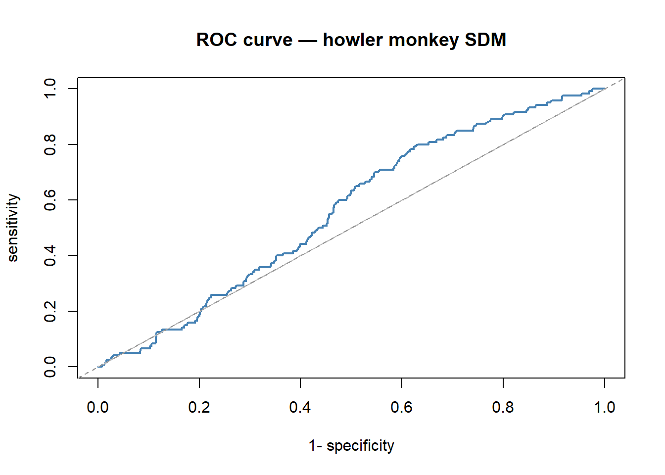
cat("AUC:", AUC::auc(roc_cv), "\n")## AUC: 0.5626377Summary table
Let’s collect everything into one tidy object.
perf_summary <- data.frame(
  AUC       = AUC::auc(roc_cv),
  TSS       = TSS,
  Kappa     = PresenceAbsence::Kappa(cmx, st.dev = FALSE),
  Sens      = sens,
  Spec      = spec,
  PCC       = PresenceAbsence::pcc(cmx, st.dev = FALSE),
  D2        = 1 - (deviance(m_step) / m_step$null.deviance),
  Threshold = thresh_cv[3, 2]
)
perf_summary
## AUC TSS Kappa Sens Spec PCC D2
## 1 0.5626377 0.1668733 0.07657907 0.7916667 0.3752066 0.4441379 0.02256085
## Threshold
## 1 0.16How does your model perform? For a simple two-predictor GLM, don’t expect perfection — but AUC above 0.7 and TSS above 0.4 suggest the model has captured something real.
Predicting across the landscape
Now the rewarding part: projecting the model across Costa Rica to produce a distribution map. This is conceptually simple — we take the fitted model and apply it to every pixel in our raster stack.
# Build a data frame from the raster: one row per pixel with x, y, and all predictors
env_df         <- data.frame(crds(env_stack), as.data.frame(env_stack))
env_df$pred_glm <- predict(m_step, newdata = env_df, type = "response")

# Reconstruct as a raster for plotting
r_pred <- terra::rast(env_df[, c('x', 'y', 'pred_glm')],
                      type = 'xyz', crs = crs(env_stack))

plot(r_pred, main = "Howler monkey — predicted occurrence probability")
plot(st_geometry(region), add = TRUE, border = "black", lwd = 1.2)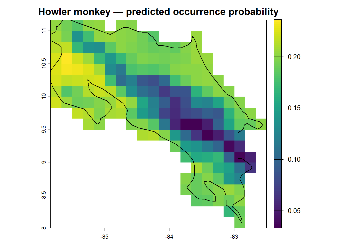
We can also make a binary presence/absence map using our selected threshold:
env_df$bin_glm <- ifelse(env_df$pred_glm >= thresh_cv[3, 2], 1, 0)

r_bin <- terra::rast(env_df[, c('x', 'y', 'bin_glm')],
                     type = 'xyz', crs = crs(env_stack))

plot(r_bin, main = "Howler monkey — predicted presence/absence",
     col = c("grey90", "tomato"))
plot(st_geometry(region), add = TRUE, border = "black", lwd = 1.2)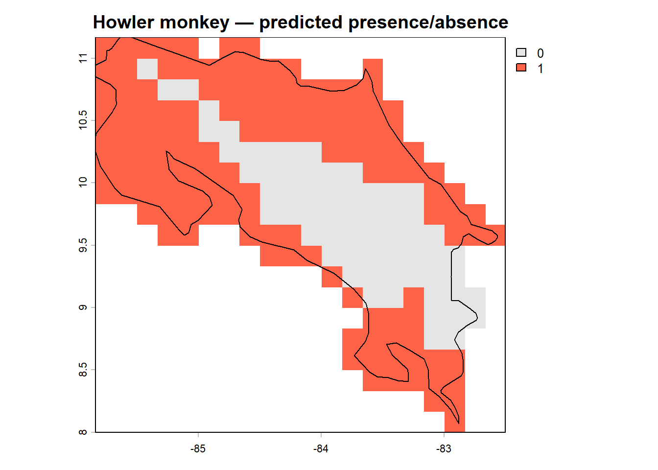
Compare the two maps. Where does the model predict highest occurrence probability? Does this align with what you’d expect from the species’ known distribution in lowland and mid-elevation Costa Rican forest? Are there areas of predicted presence that seem surprising, or areas of absence that seem like they should be suitable?
Predicting under future climate
One of the most powerful applications of SDMs is projecting species range shifts under climate change. We can download future climate projections from WorldClim and run our model on them with no modifications. Our model stays the same, only the input data changes. This is called temporal transferability, and it’s one of the key reasons SDMs are so widely used in conservation planning (Araújo et al. 2019).
library(geodata)

# terra SpatVectors cannot be saved and reloaded reliably between sessions —
# recreate region_vect from the sf object after loading region.RData
region_vect <- vect(region)

# Future climate: 2041-2060, SSP2-4.5 (moderate emissions scenario)
# Set download = TRUE the first time
bio_fut <- geodata::cmip6_world(
  model    = 'ACCESS-ESM1-5',
  ssp      = '245',
  time     = '2041-2060',
  var      = 'bioc',
  download = FALSE,
  res      = 10,
  path     = 'data'
)

bio_fut <- terra::crop(bio_fut, region_vect)
bio_fut <- terra::mask(bio_fut, region_vect)

# CMIP6 variable names differ from WorldClim; rename to match our model
names(bio_fut) <- c(paste0('bio0', 1:9), paste0('bio', 10:19))
fut_df <- data.frame(crds(bio_fut), as.data.frame(bio_fut))
fut_df$pred_glm <- predict(m_step, newdata = fut_df, type = "response")
r_pred_fut <- terra::rast(fut_df[, c('x', 'y', 'pred_glm')],
type = 'xyz', crs = crs(env_stack))
# Side-by-side comparison
par(mfrow = c(1, 2))
plot(r_pred, main = "Current climate", zlim = c(0, 1))
plot(r_pred_fut, main = "Future climate (2041–60)", zlim = c(0, 1))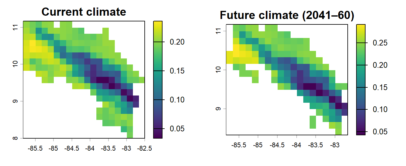
par(mfrow = c(1, 1))What has changed? Does the predicted range expand, contract, or shift geographically? For a lowland tropical species like Alouatta palliata, range contractions under warming scenarios are a common model finding, though the picture is complicated by forest cover, dispersal ability, and the specifics of which climate variables drive the model (Mendoza-González et al. 2013).
Always interpret future projections with appropriate caution. They assume the modelled species-environment relationship is stable over time, that the species can actually reach newly suitable areas, and that other factors (habitat loss, disease, hunting) don’t intervene. They are scenarios, not predictions.
Save your work
terra::writeRaster(bio_fut, 'data/bio_fut.tif', overwrite = TRUE)
terra::writeRaster(r_pred, 'data/pred_current.tif', overwrite = TRUE)
terra::writeRaster(r_pred_fut, 'data/pred_future.tif', overwrite = TRUE)
save(m_step, my_preds, preds_cv, thresh_cv, perf_summary,
     file = 'data/module10_sdm.RData')
Exercise
- Fit an alternative model (
m2) using more variables inpred_selinstead of just the top two. - Run cross-validation on
m2using the same 5-fold code. - Compare the performance of
m_stepandm2using AUC, TSS, and explained deviance. - Project
m2under current and future climate and compare the maps to those fromm_step.
- Which model performs better by cross-validated AUC?
- Do the two models predict similar or different distributions under future climate?
- What might explain the differences?
References
Allouche, O., Tsoar, A. & Kadmon, R. (2006). Assessing the accuracy of species distribution models: prevalence, kappa and the true skill statistic (TSS). Journal of Applied Ecology, 43, 1223–1232.
Araújo, M.B., Anderson, R.P., Barbosa, A.M., Beresford, A.E., Boykoff, M., Buchkowski, R.W., Chen, Y., Dolan, J., Donald, P.F., Duarte, C.M., Elith, J., Emerson, B., Gavin, D.G., Guisan, A., Hijmans, R.J., Huettmann, F., Jetz, W., Kissling, W.D., Lees, A.C., Levinsky, I., Loyola, R., Merow, C., Mestre, F., Nori, J., Olivero, J., Osborne, P.E., Pagel, J., Pearson, R.G., Peterson, A.T., Platts, P.J., Regan, H., Santos, M.J., Soria-Auza, R.W., Thuiller, W., Veloz, S.D., Warren, D.L. & Rahbek, C. (2019). Standards for distribution models in biodiversity assessments. Science Advances, 5, eaat4858.
Liu, C., Berry, P.M., Dawson, T.P. & Pearson, R.G. (2005). Selecting thresholds of occurrence in the prediction of species distributions. Ecography, 28, 385–393.
Mendoza-González, G., Martínez, M.L., Lithgow, D., Pérez-Maqueo, O. & Simonin, P. (2013). Land use change and its effects on the value of ecosystem services along the coast of the Gulf of Mexico. Ecological Economics, 82, 23–32.