Are patterns real?
For this module, you’ll need the following packages:
sfrgbifrnaturalearthrnaturalearthdataterrageodatadplyr
We’ve mapped our species. Now we can ask a more difficult and important question: do these patterns tell us something ecological, or just something about how the data were collected?
This is not a minor technical concern. It’s one of the most consequential questions in applied biodiversity science. Models and conservation decisions built on spatially biased data can point in entirely the wrong direction, such as identifying “hotspots” that are really just survey hotspots, or predicting absences in places no one has ever looked (Guillera-Arroita et al. 2015).
The pattern we’re starting with
plot(st_geometry(region), main = "Mantled howler monkey — Costa Rica")
plot(st_geometry(howler_sf), add = TRUE, col = "red", pch = 19, cex = 0.5)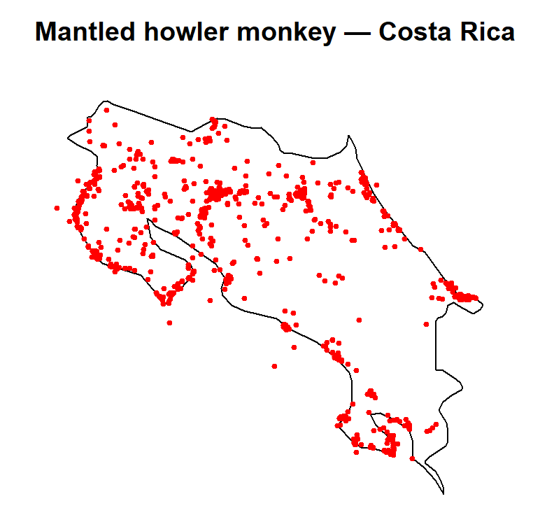
You will almost certainly see clusters. The temptation is to assume that howler monkeys simply prefer those areas. But there are at least three distinct explanations for spatial clustering in GBIF data:
- Ecological preference; the species genuinely uses certain habitats, avoids others, or is constrained by climate or resources
- Physical barriers; mountains, rivers, land cover, or urbanisation limiting movement or distribution
- Sampling bias; researchers, volunteers, and recorders tend to work near roads, cities, universities, and established field stations (Beck et al. 2014)
What you see in the GBIF data is the product of ecology and observation effort combined. Disentangling these is non-trivial, but we can start with some simple diagnostics.
Comparing observed patterns to random
A useful baseline is to ask: what would the data look like if points
were scattered completely at random across the study region? We can
simulate this with st_sample(), which draws random points
from within a polygon.
set.seed(42)  # set.seed() ensures the random points are the same every time you run this
               # see https://researchdatapod.com/understanding-set-seed-r-comprehensive-guide/

random_points <- st_sample(region, size = nrow(howler_sf))

plot(st_geometry(region), main = "Observed (red) vs random (blue)")
plot(random_points, add = TRUE, col = "steelblue", pch = 19, cex = 0.4)
plot(st_geometry(howler_sf), add = TRUE, col = "tomato", pch = 19, cex = 0.4)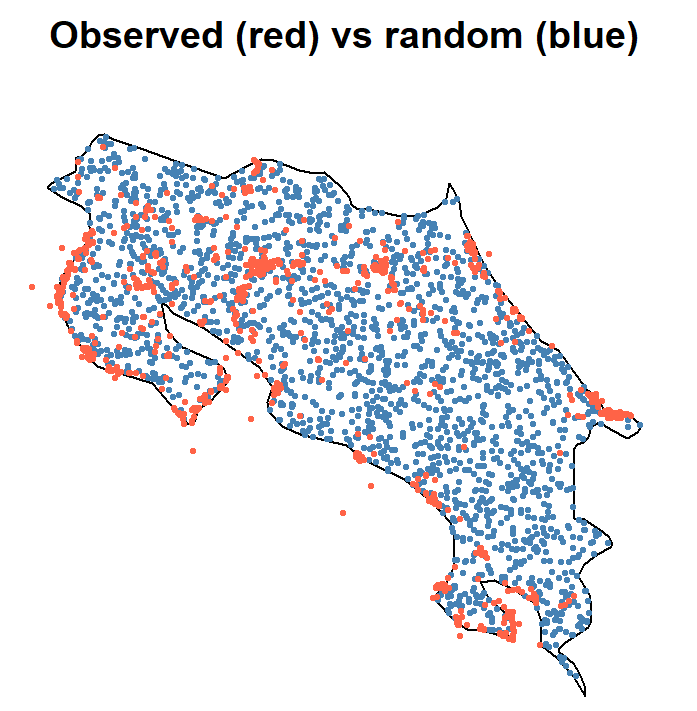
Randomly distributed points look even — no obvious gaps or concentrations. If the observed data (red) looks substantially more clustered than the random points (blue), that’s worth investigating. Eyeballing is a start, but it’s subjective. Let’s quantify it.
Quantifying clustering with a grid
We can overlay a grid on the study region, count how many points fall in each cell, and compare the variability between observed and random counts. The logic is simple: random data should be relatively even across cells; clustered data will show high variance, i.e., lots of cells with zero records and some cells with many.
library(dplyr)

grid    <- st_make_grid(region, cellsize = 0.2)
grid_sf <- st_sf(geometry = grid)

obs_counts <- st_join(grid_sf, howler_sf) %>%
  dplyr::count(geometry)

rand_sf    <- st_sf(geometry = random_points)
rand_counts <- st_join(grid_sf, rand_sf) %>%
  dplyr::count(geometry)

# Compare spread: higher SD = more clustered
sd(obs_counts$n, na.rm = TRUE)
## [1] 22.13138sd(rand_counts$n, na.rm = TRUE)## [1] 8.397568If the observed standard deviation is noticeably higher than the random one, the data are more spatially aggregated than chance would produce. This is spatial heterogeneity (uneven distribution across space) and it’s a direct expression of Tobler’s first law: nearby locations tend to be more similar, so species (and observers) cluster rather than spread evenly.
This clustering is also related to spatial autocorrelation: nearby records are not independent of each other, which matters enormously for statistical inference. Models that ignore spatial autocorrelation can dramatically underestimate uncertainty and produce falsely precise results (Dormann et al. 2007).
Is the clustering linked to environment?
Clustering alone doesn’t tell us why records clump. To start testing environmental hypotheses, we can extract elevation at each occurrence point and compare it between high-density and low-density grid cells.
# Extract elevation at each howler occurrence
howler_vect  <- vect(howler_sf)
howler_sf$elev <- terra::extract(elev_cr[[1]], howler_vect)[, 2]

# Assign cell counts to the grid
grid_sf$counts <- obs_counts$n
grid_sf$counts[is.na(grid_sf$counts)] <- 0

# Split grid into high- and low-density cells
high <- grid_sf[grid_sf$counts > median(grid_sf$counts, na.rm = TRUE), ]
low  <- grid_sf[grid_sf$counts <= median(grid_sf$counts, na.rm = TRUE), ]

# Extract mean elevation in each group of cells
high_elev <- terra::extract(elev_cr[[1]], vect(high), fun = mean, na.rm = TRUE)
low_elev  <- terra::extract(elev_cr[[1]], vect(low),  fun = mean, na.rm = TRUE)

mean(high_elev[, 2], na.rm = TRUE)
## [1] 264.1994mean(low_elev[, 2], na.rm = TRUE)## [1] 689.9616If high-density cells have systematically different mean elevations from low-density cells, that suggests at least some of the clustering is environmentally driven and not purely a sampling artefact. If they’re similar, consider other potential drivers: proximity to roads, forest cover, or the locations of known research stations.
The two-process framework
By this point, it’s useful to think about your data in two layers simultaneously:
Ecological process - Habitat preference - Climate constraints - Dispersal ability and barriers - Social behaviour and territory
Observation process - Where people looked - Road and trail accessibility - Survey effort and institutional capacity - Recording culture (citizen science vs. professional surveys)
What you see in GBIF data is the product of both, not just the ecology. If you ignore the observation process, you might conclude that howlers avoid the central highlands when in fact the central highlands are simply less accessible to field teams, or have fewer research stations. This conflation leads to poor habitat models and misguided conservation prioritisation (Phillips et al. 2009).
There is no simple fix for sampling bias, but awareness of it shapes how we design our analyses: we’ll use background points sampled from within the region rather than true absences, apply spatial thinning to reduce over-representation of surveyed areas, and interpret model outputs with appropriate scepticism. All of that comes in Modules 7–10.
References
Beck, J., Böller, M., Erhardt, A. & Schwanghart, W. (2014). Spatial bias in the GBIF database and its effect on modeling species’ geographic distributions. Ecological Informatics, 19, 10–15.
Dormann, C.F., McPherson, J.M., Araújo, M.B., Bivand, R., Bolliger, J., Carl, G., Davies, R.G., Hirzel, A., Jetz, W., Kissling, W.D., Kühn, I., Ohlemüller, R., Peres-Neto, P.R., Reineking, B., Schröder, B., Schurr, F.M. & Wilson, R. (2007). Methods to account for spatial autocorrelation in the analysis of species distributional data: a review. Ecography, 30, 609–628.
Guillera-Arroita, G., Lahoz-Monfort, J.J., Elith, J., Gordon, A., Kujala, H., Lentini, P.E., McCarthy, M.A., Tingley, R. & Wintle, B.A. (2015). Is my species distribution model fit for purpose? Matching data and models to applications. Global Ecology and Biogeography, 24, 276–292.
Phillips, S.J., Dudík, M., Elith, J., Graham, C.H., Lehmann, A., Leathwick, J. & Ferrier, S. (2009). Sample selection bias and presence-only distribution models: implications for background and pseudo-absence data. Ecological Applications, 19, 181–197.