Exploring species-environment relationships
For this module, you’ll need the following packages:
sfterra
In Modules 7 and 8 we cleaned the occurrence data and built a combined data frame of presence and background points with their environmental values. In Module 9 we’ll fit a formal model. But before we do any of that, we’re going to look at the data.
This step is sometimes skipped in the rush to get to the modelling, but it’s one of the most scientifically valuable things you can do. Exploratory analysis helps you understand which variables are likely to matter, form predictions about what the model should find, and catch problems before they cause cryptic errors downstream. A model fitted without prior exploration is a model you don’t fully understand.
Load your data
load('data/region.RData')
load('data/module7_occdata.RData')
env_stack <- terra::rast('data/env_stack.tif')

# Reminder of what we're working with
nrow(howler_sdm)
## [1] 725table(howler_sdm$occ) # 1 = presence, 0 = background##
## 0 1
## 605 120Where do howler monkeys occur environmentally?
The key question for an SDM is: what environmental conditions do howler monkeys occupy, and how does that differ from what’s available across the landscape? Before fitting a model, we want a visual answer to this.
A good place to start is boxplots, comparing values at presence points against background points. For each variable, a systematic shift between the two distributions is a signal that the variable might matter for the model.
vars_to_plot <- c('bio01', 'bio04', 'bio12', 'bio15', 'elev')

par(mfrow = c(2, 3), mar = c(4, 4, 2, 1))

for (v in vars_to_plot) {
  boxplot(howler_sdm[[v]] ~ howler_sdm$occ,
          names  = c("Background", "Presence"),
          col    = c("grey80", "tomato"),
          ylab   = v,
          main   = v,
          outline = FALSE)
}
par(mfrow = c(1, 1))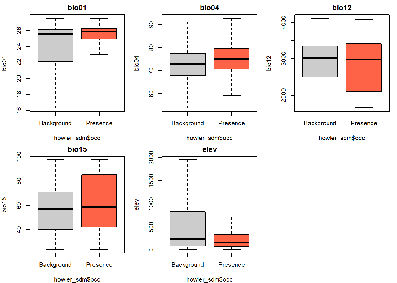
For each variable, ask:
- Is the median shifted between presence and background?
- Is the spread (box width) different?
- Is the difference ecologically interpretable? Does it match what you know about howler monkey biology?
Howler monkeys in Costa Rica are predominantly lowland animals, typically associated with warm, humid forest below about 1,500 m (Fedigan & Jack 2001). You might therefore expect presences to cluster at lower elevations and higher temperatures than background points — but check whether your data agrees.
Density plots: seeing the full distribution
Boxplots summarise distributions but hide their shape.Density plots show more detail, including whether a distribution is unimodal (one peak), bimodal (two peaks), or skewed. This matters for modelling: a species with a hump-shaped response to temperature (most common at intermediate values) needs a quadratic term in the model; a monotonic response (simply more common at higher temperatures) can be captured with a linear term.
par(mfrow = c(2, 3), mar = c(4, 4, 2, 1))

for (v in vars_to_plot) {
  pres_vals <- howler_sdm[[v]][howler_sdm$occ == 1]
  bg_vals   <- howler_sdm[[v]][howler_sdm$occ == 0]

  d_pres <- density(pres_vals, na.rm = TRUE)
  d_bg   <- density(bg_vals,   na.rm = TRUE)

  plot(d_bg, col = "grey60", lwd = 2,
       main = v, xlab = v,
       ylim = c(0, max(d_pres$y, d_bg$y) * 1.15))
  lines(d_pres, col = "tomato", lwd = 2)
  legend("topright", legend = c("Background", "Presence"),
         col = c("grey60", "tomato"), lwd = 2, bty = "n", cex = 0.8)
}
par(mfrow = c(1, 1))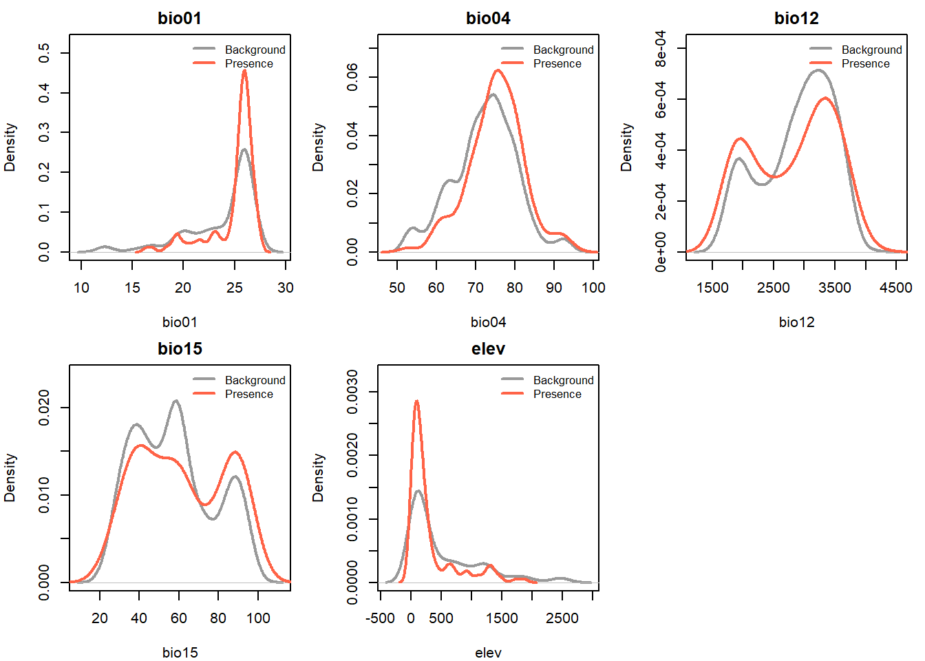
Variables where the presence density (red) is a narrow peak sitting inside a broader background distribution (grey) are potentially very useful predictors and suggest the species is selecting a subset of available conditions. Variables where the two curves almost completely overlap probably won’t add much.
Environmental space: two variables at once
Species don’t experience temperature and rainfall in isolation — they experience the combination. A scatterplot of two variables, with presence and background points coloured differently, lets us see whether the species occupies a specific corner of environmental space (also called climate or niche space).
# Change these to whatever looked most different in your boxplots
v1 <- 'bio01'
v2 <- 'bio12'

plot(
  howler_sdm[[v1]][howler_sdm$occ == 0],
  howler_sdm[[v2]][howler_sdm$occ == 0],
  col  = adjustcolor("grey60", alpha.f = 0.3),
  pch  = 19, cex = 0.5,
  xlab = paste(v1, "(×0.1 °C)"),
  ylab = paste(v2, "(mm)"),
  main = "Environmental space — howler monkey"
)
points(
  howler_sdm[[v1]][howler_sdm$occ == 1],
  howler_sdm[[v2]][howler_sdm$occ == 1],
  col = adjustcolor("tomato", alpha.f = 0.7),
  pch = 19, cex = 0.7
)
legend("topright", legend = c("Background", "Presence"),
       col = c("grey60", "tomato"), pch = 19, bty = "n")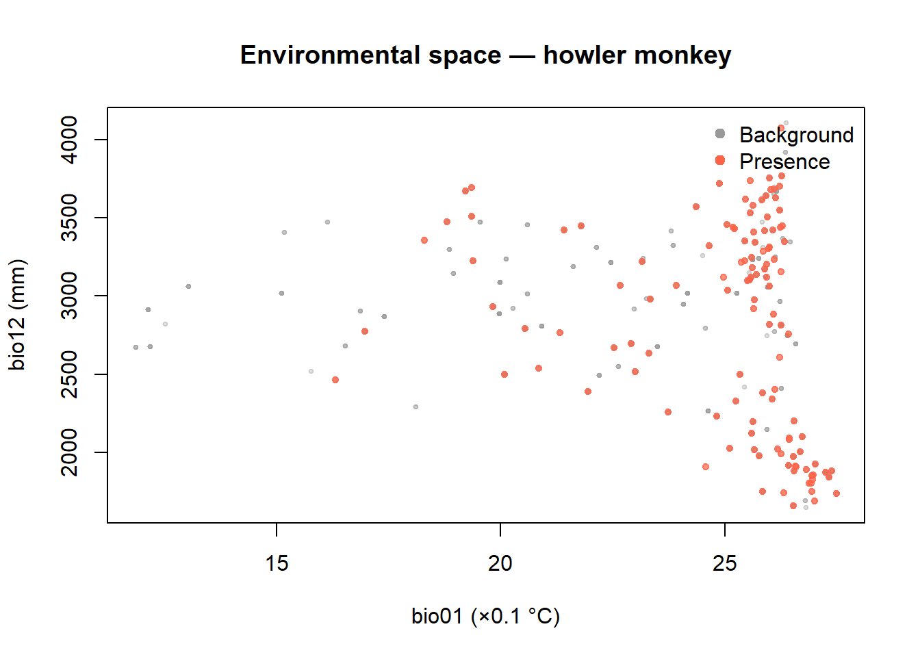
If the red cluster occupies a distinct region of the plot, say, high temperature and high precipitation, while background points are spread more broadly, that’s a strong signal that the model has something real to learn. This visualisation is conceptually related to the ecological niche concept: the species occupies a subset of the available environmental space.
Correlation among predictors
We have 20 potential predictors (19 bioclim variables plus elevation). Many are highly correlated with each other — mean annual temperature and mean temperature of the warmest quarter, for instance, will track each other very closely. Including redundant predictors doesn’t improve a model; it can make it unstable.
Let’s visualise correlations with a heatmap.
env_vars <- howler_sdm[, 4:ncol(howler_sdm)]
cor_mat  <- cor(env_vars, method = 'spearman', use = 'complete.obs')

# Hierarchical clustering to order variables by similarity
ord         <- hclust(as.dist(1 - abs(cor_mat)))$order
cor_ordered <- cor_mat[ord, ord]

image(
  1:ncol(cor_ordered), 1:nrow(cor_ordered), t(cor_ordered),
  col  = colorRampPalette(c("steelblue", "white", "tomato"))(100),
  xaxt = "n", yaxt = "n", xlab = "", ylab = "",
  main = "Spearman correlation between predictors"
)
axis(1, at = 1:ncol(cor_ordered), labels = colnames(cor_ordered), las = 2, cex.axis = 0.7)
axis(2, at = 1:nrow(cor_ordered), labels = rownames(cor_ordered), las = 2, cex.axis = 0.7)
Deep red = strong positive correlation; deep blue = strong negative correlation; white = near-zero correlation.
Clusters of highly correlated variables (blocks of red) are largely measuring the same thing. We’ll deal with this formally in Module 9 using an automated variable selection procedure.
A rough importance ranking
Before we fit anything, we can get a numerical sense of which variables are most different between presences and background — a simple proxy for how useful they might be.
separation <- sapply(names(env_vars), function(v) {
  pres_mean <- mean(howler_sdm[[v]][howler_sdm$occ == 1], na.rm = TRUE)
  bg_mean   <- mean(howler_sdm[[v]][howler_sdm$occ == 0], na.rm = TRUE)
  bg_sd     <- sd(howler_sdm[[v]][howler_sdm$occ == 0],   na.rm = TRUE)
  abs(pres_mean - bg_mean) / bg_sd
})

sort(separation, decreasing = TRUE)
## bio04 bio05 bio10 bio11 bio01 bio09 elev
## 0.35453039 0.34495678 0.33871287 0.33580343 0.33572950 0.33199661 0.32905972
## bio08 bio06 bio03 bio15 bio18 bio12 bio07
## 0.32895947 0.31966531 0.21858531 0.20691138 0.20625199 0.13282262 0.12646305
## bio14 bio17 bio02 bio13 bio19 bio16
## 0.12444438 0.12236635 0.06237963 0.04672596 0.02436338 0.02408756This standardised separation metric (effect size, roughly) ranks variables by how much their mean differs between presences and background, relative to background variability. Variables near the top of this list are worth prioritising in the model. Keep note of the top three or four — we’ll see how they compare to what the formal variable selection procedure identifies in Module 9.
Before we finish, let’s save our environmental variables data frame for later use.
env_vars <- write.csv(env_vars, "data/env_vars.csv") # write for use in later modulesExercise
Add
bio07(temperature annual range) to your density plot loop. Is there a clear difference between presences and background? Given that howler monkeys live in tropical forest, would you expect them to be more sensitive to temperature seasonality or to mean temperature?Make a scatterplot of
bio04(temperature seasonality) versusbio15(precipitation seasonality). Do howler monkey occurrences cluster in a particular corner of this space?Based on the correlation heatmap, identify two variables with very high correlation (|r| > 0.8). Then identify two variables with very low correlation. Which of the second pair would you expect to be more useful in an SDM, based on the density plots?
References
Fedigan, L.M. & Jack, K. (2001). Neotropical primates in a regenerating Costa Rican dry forest: a comparison of howler and capuchin population patterns. International Journal of Primatology, 22, 689–713.